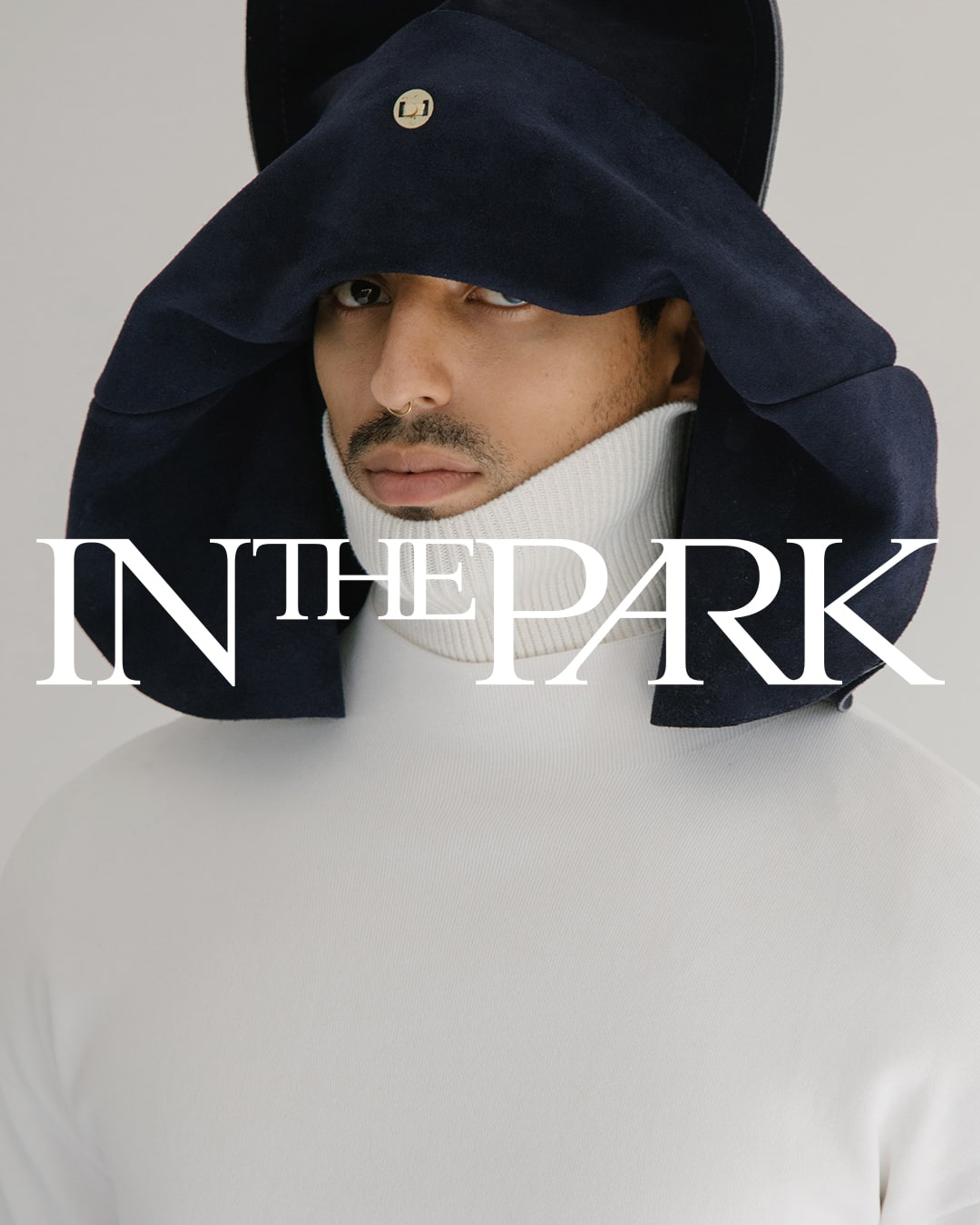
In The Park,
Redefining talent representation by amplifying voices and shaping culture.
(Services)Brand IdentityWeb DesignMotion Identity
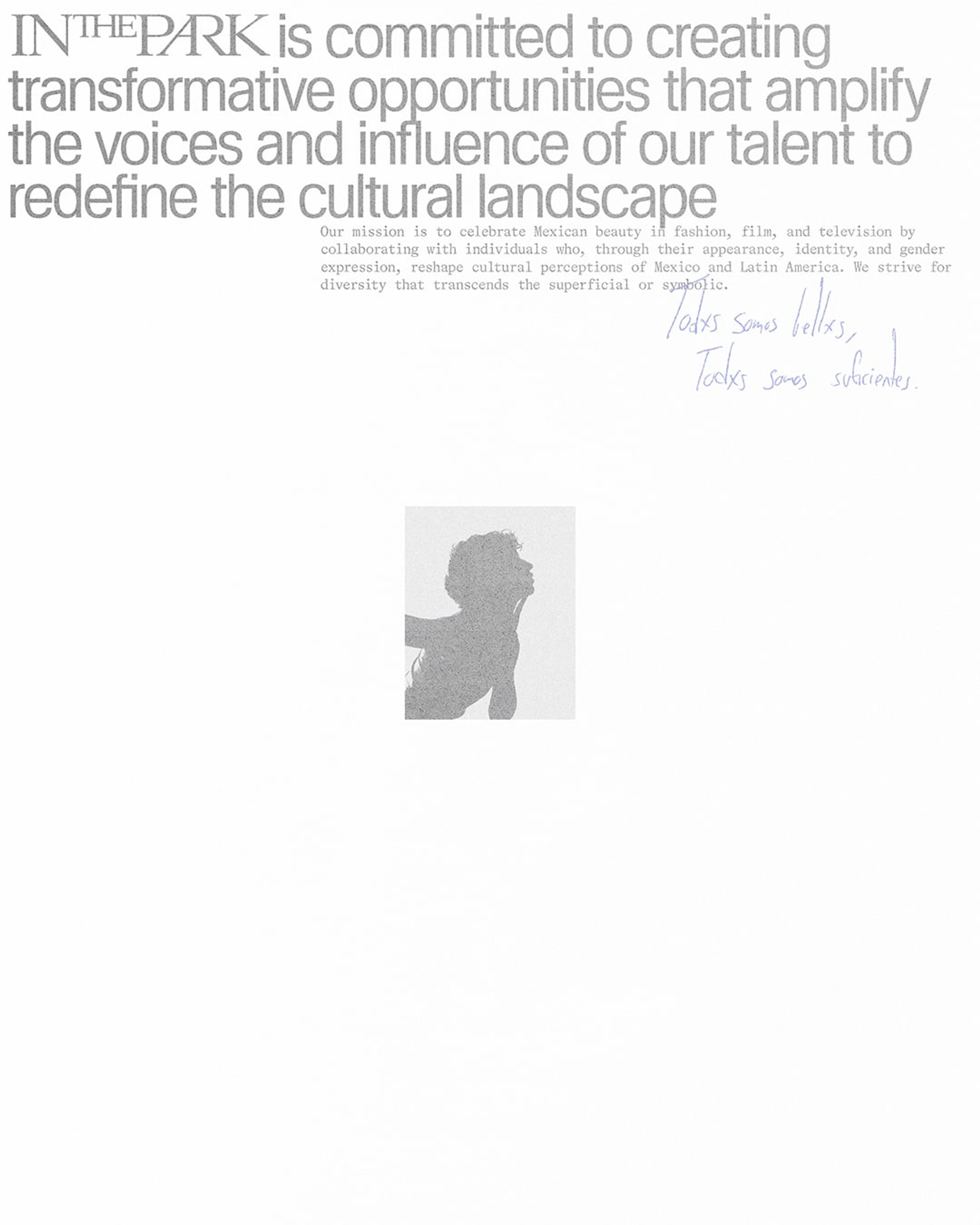
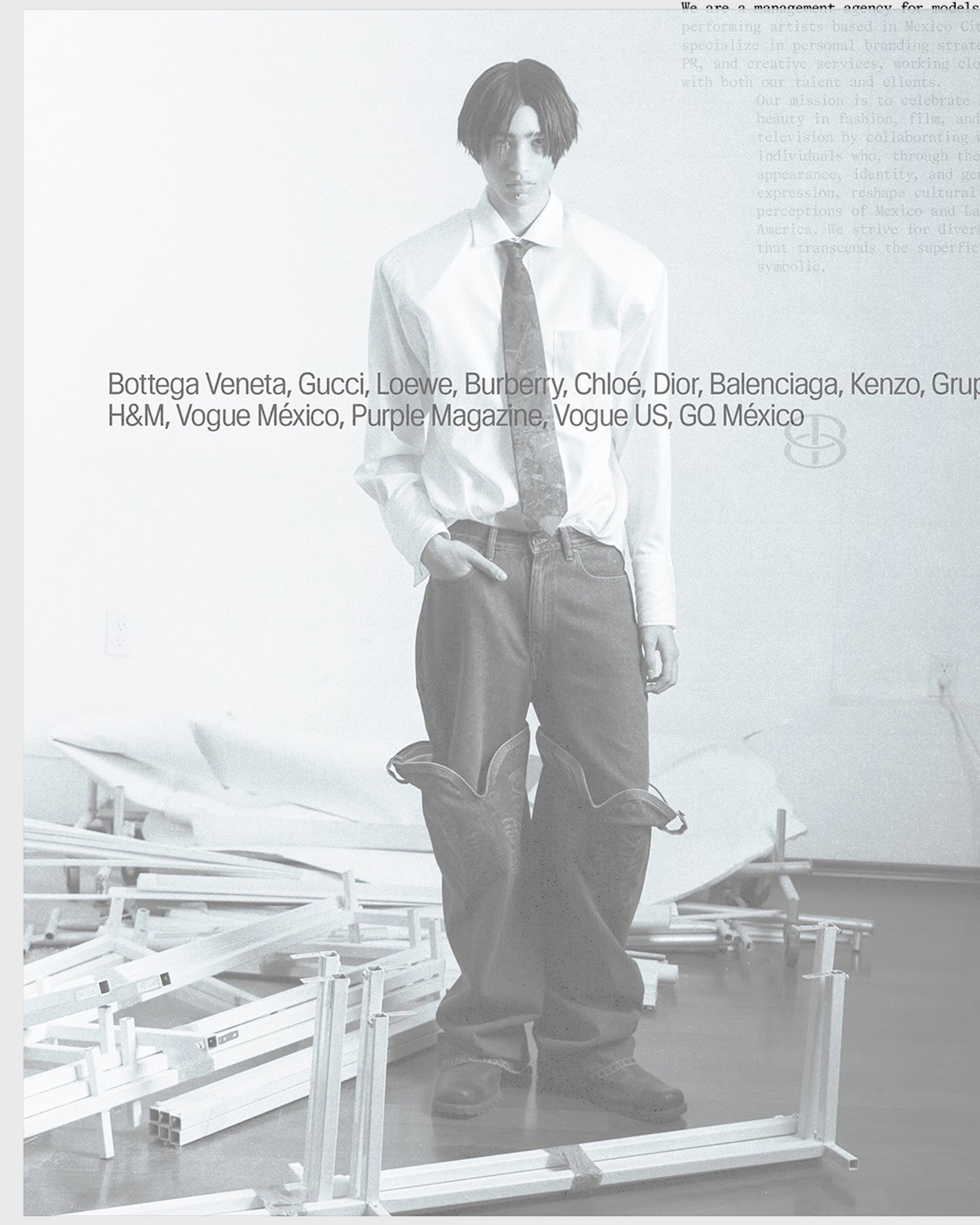
Talent management is often reduced to logistics. Contracts, bookings, percentages, visibility. For In The Park, representation means something more human: a commitment to advocacy, protection, and the recognition of talent as whole individuals.
The name itself carries deep significance. A park is more than just a space. It is a sanctuary, a meeting ground, a place of refuge and possibility. For founder Carlos Castellanos, it was personal—a metaphor for the kind of environment he wanted to build for the talent he represents. It became a way to frame the agency as both a sanctuary and a platform, a space where talent could be seen, supported, and allowed to grow.
Our work focused on translating that sense of care into a brand system with enough authority to represent serious talent, and enough warmth to make each individual feel known.


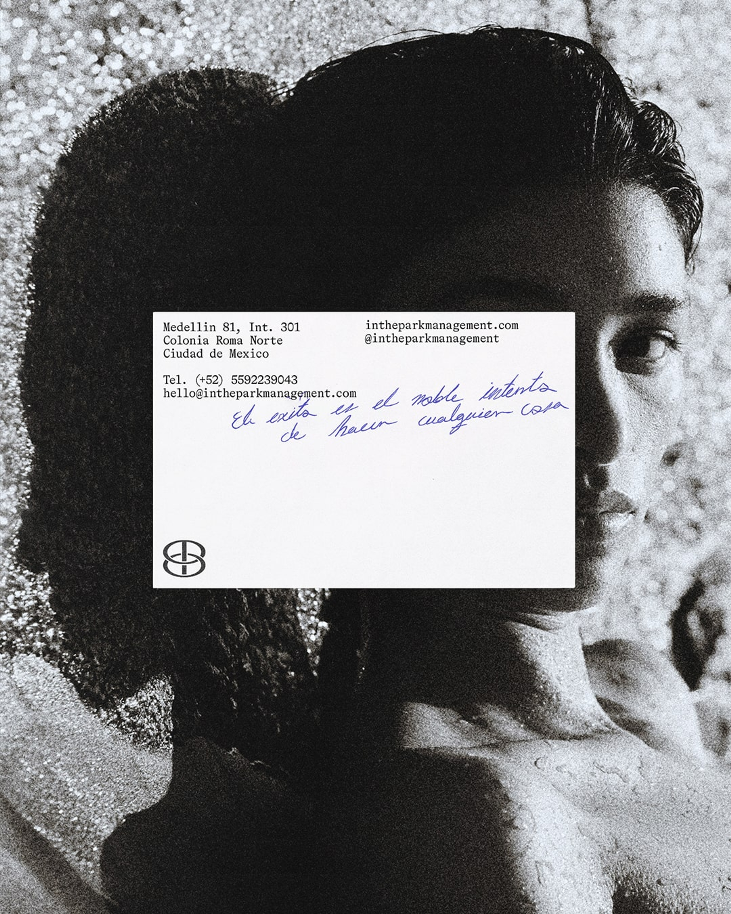
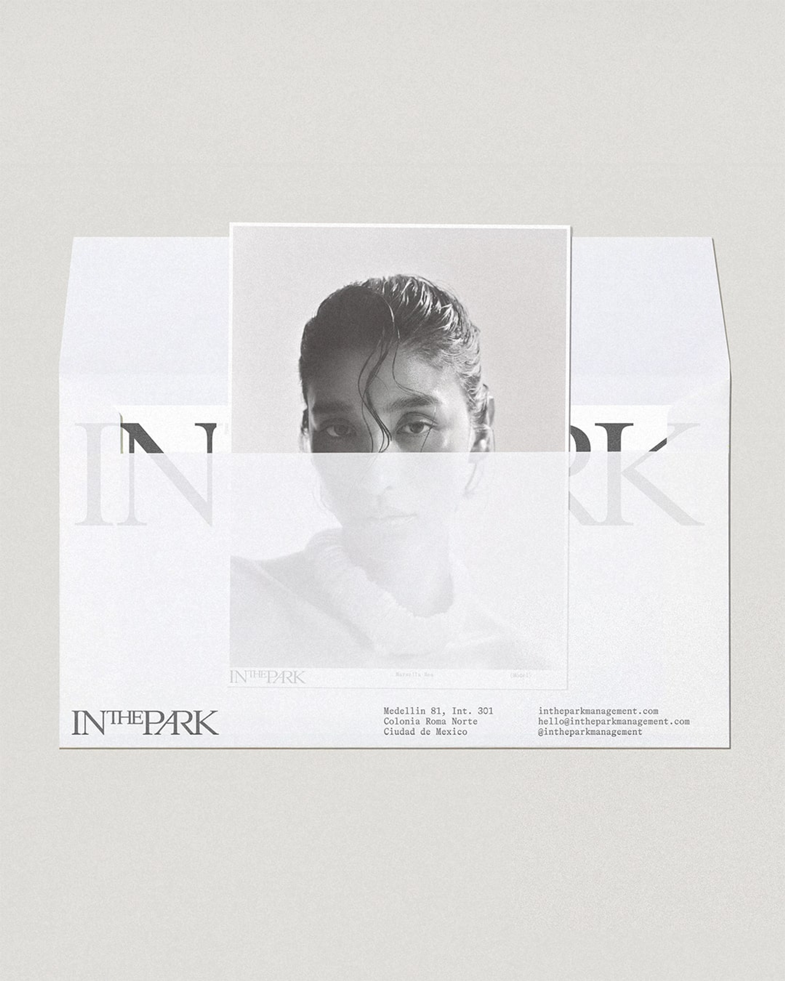
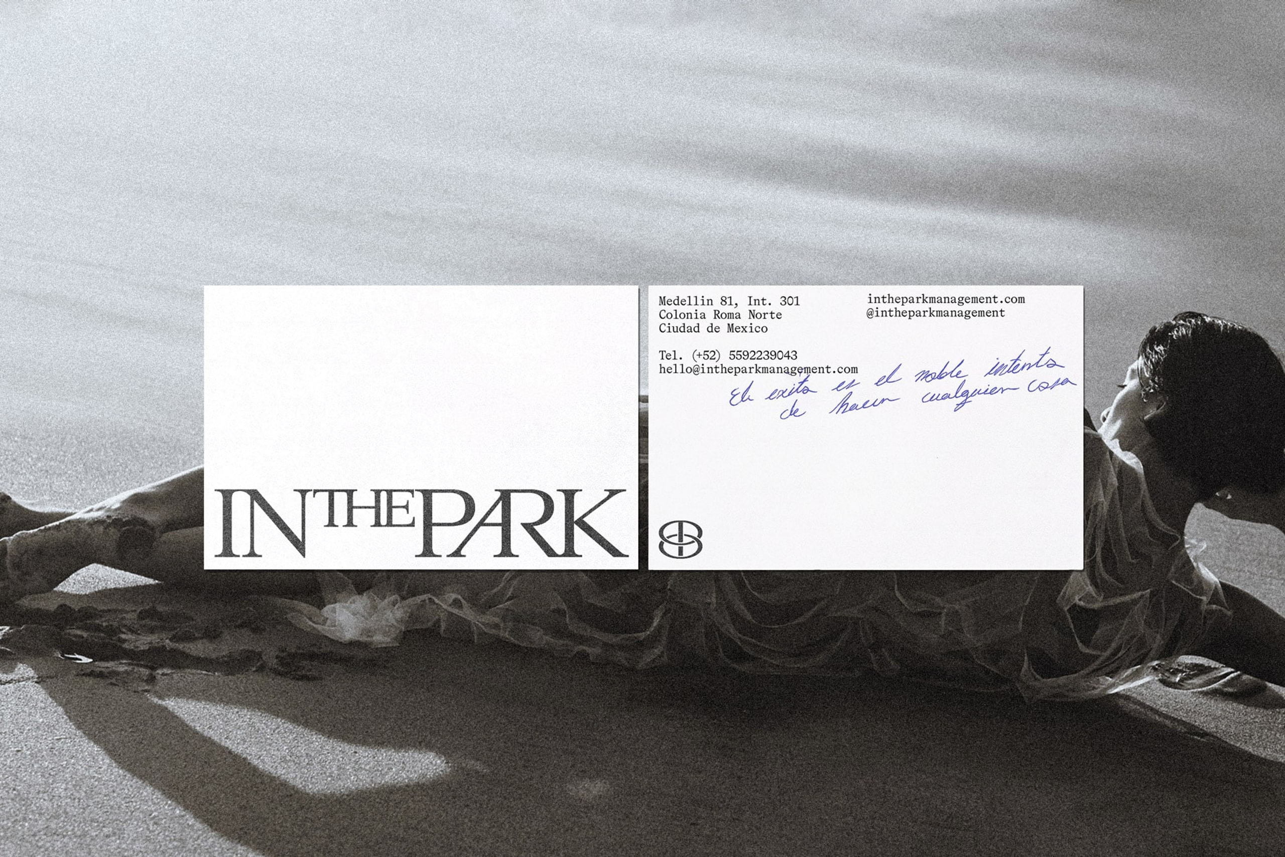
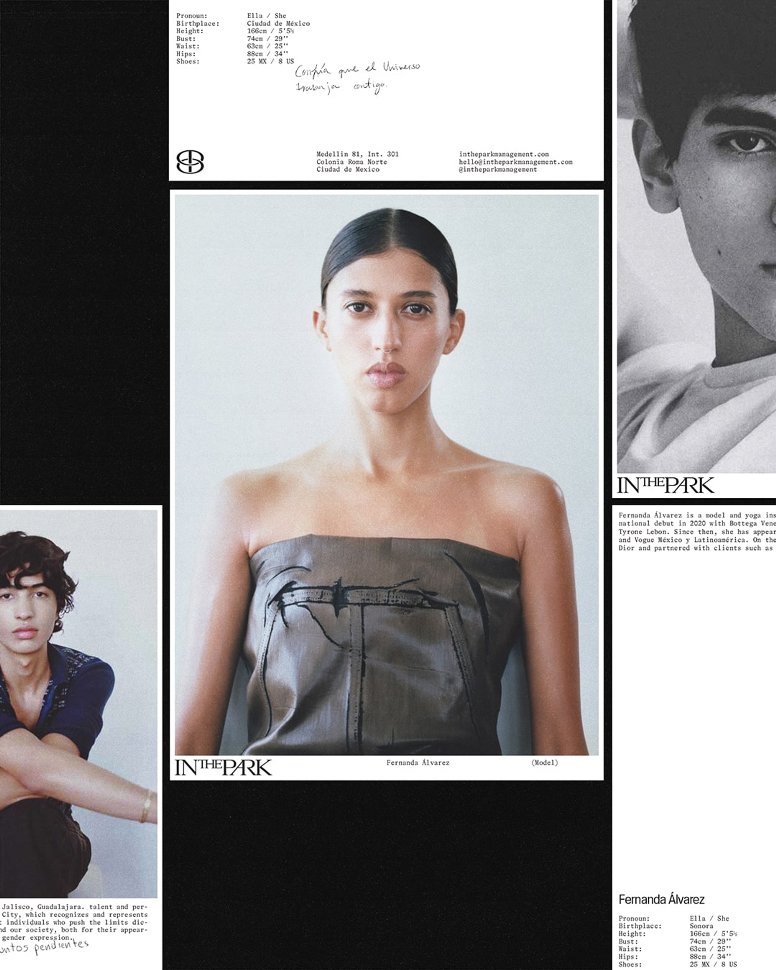
Handwritten signatures and personal notes reinforce the agency’s ethos: talent is not just seen, but known.

"BonTemps didn’t just understand the essence of In The Park—they amplified our values. Our brand now feels stronger, more elevated, and fully aligned with our vision."
Carlos Castellanos
Founder & Director, In The Park


Identity & Visual Direction
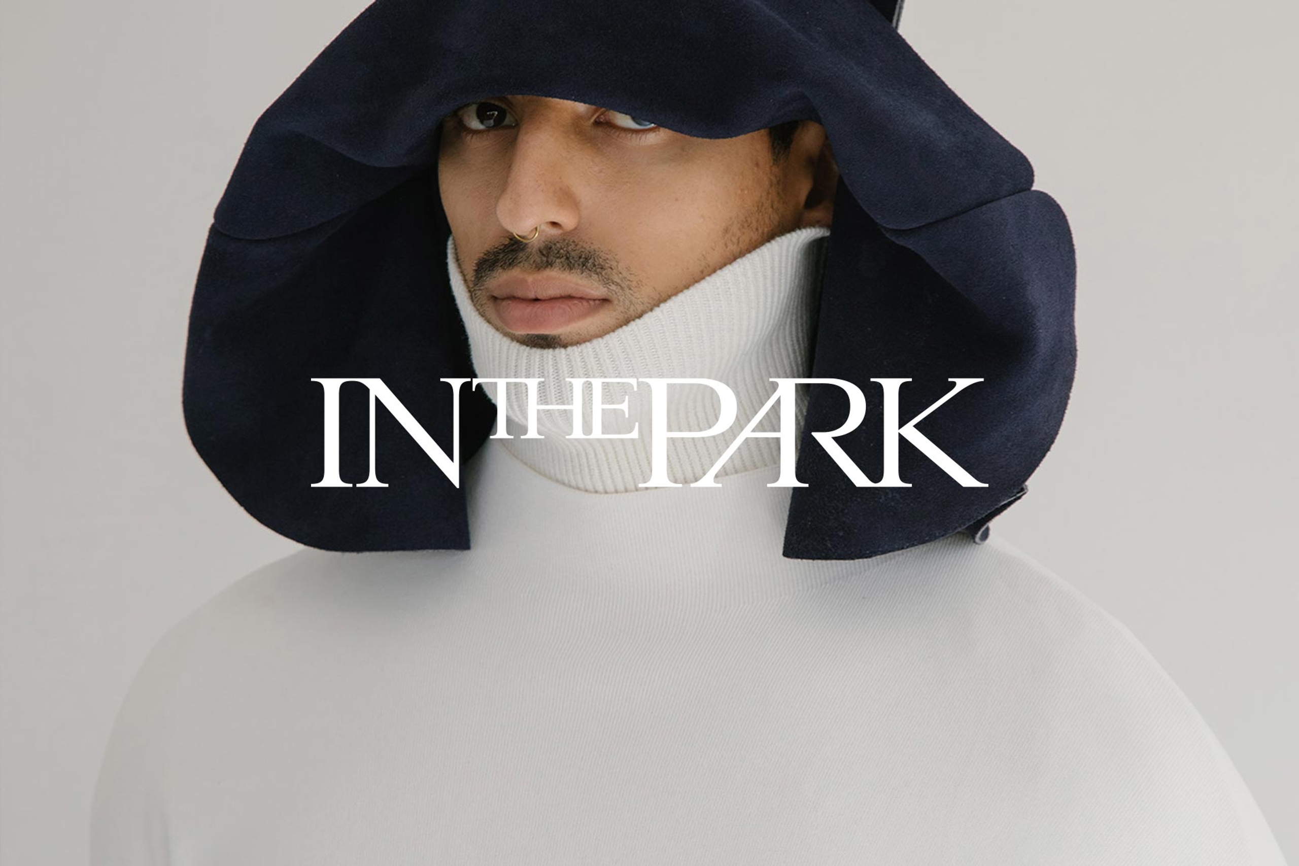
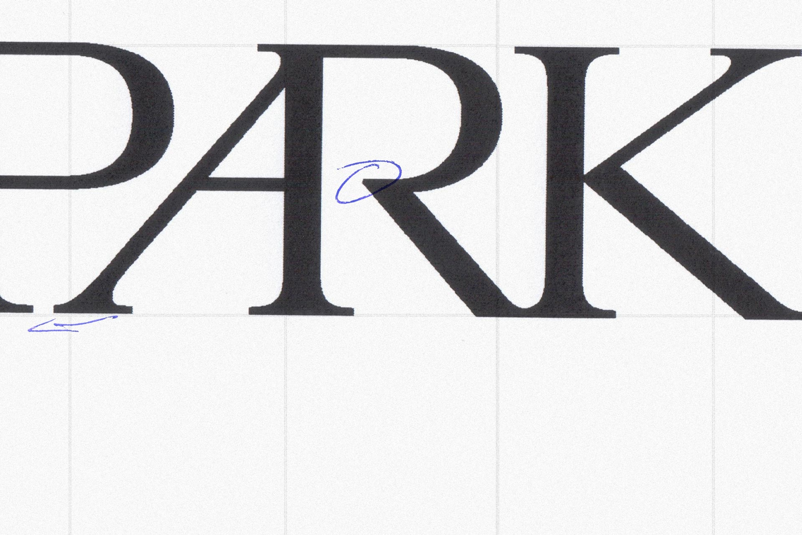
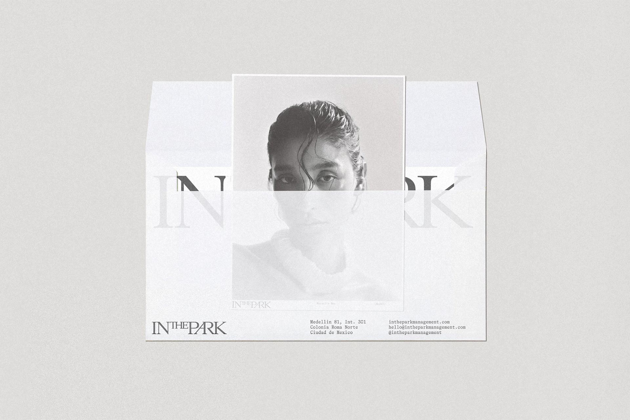
The identity is built around a custom serif wordmark that feels intimate and commanding in equal measure. Organic flourishes within the letterforms suggest nature, connection, and growth, while the overall structure gives the agency a sense of stature and legacy. The result is a mark that feels personal while exuding prestige and interconnectedness.
During the strategy and creative direction phase, we imagined the ‘In The Park’ logotype as resembling a gathering of trees, symbolizing strength, freedom, and mutual protection.
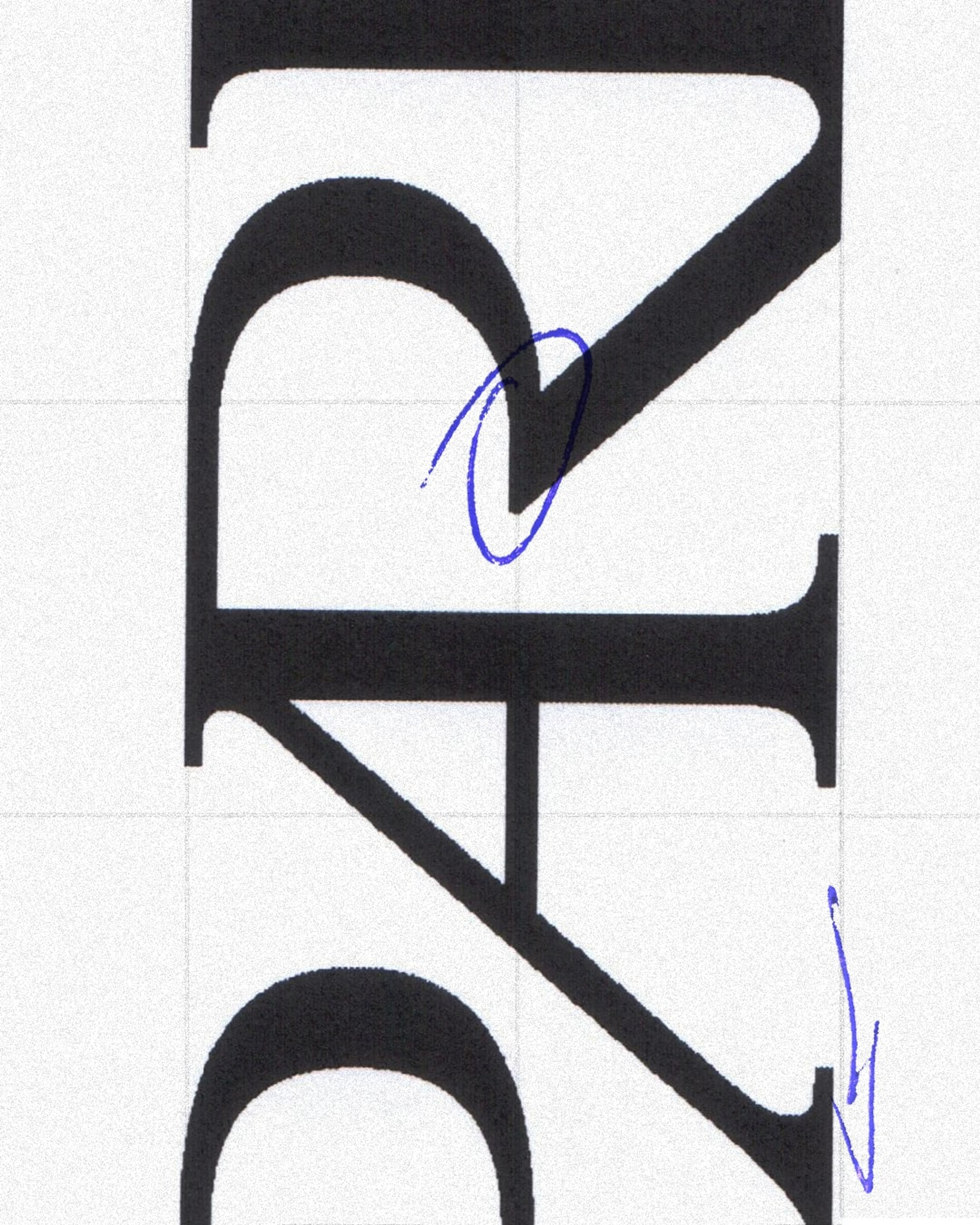
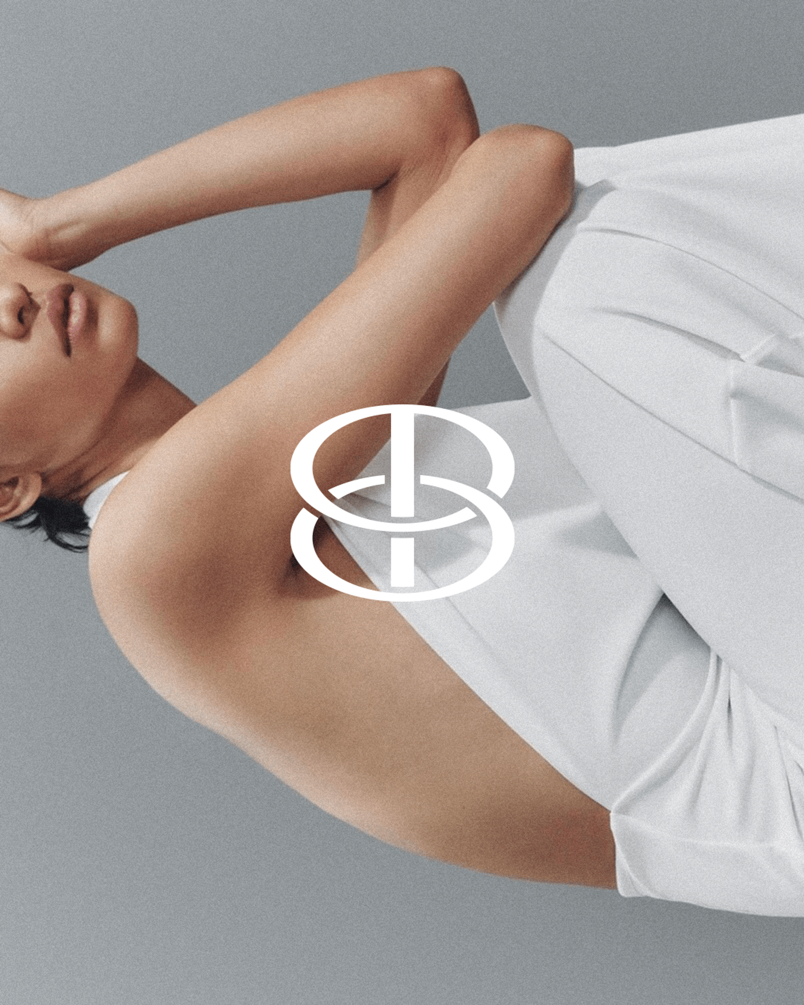
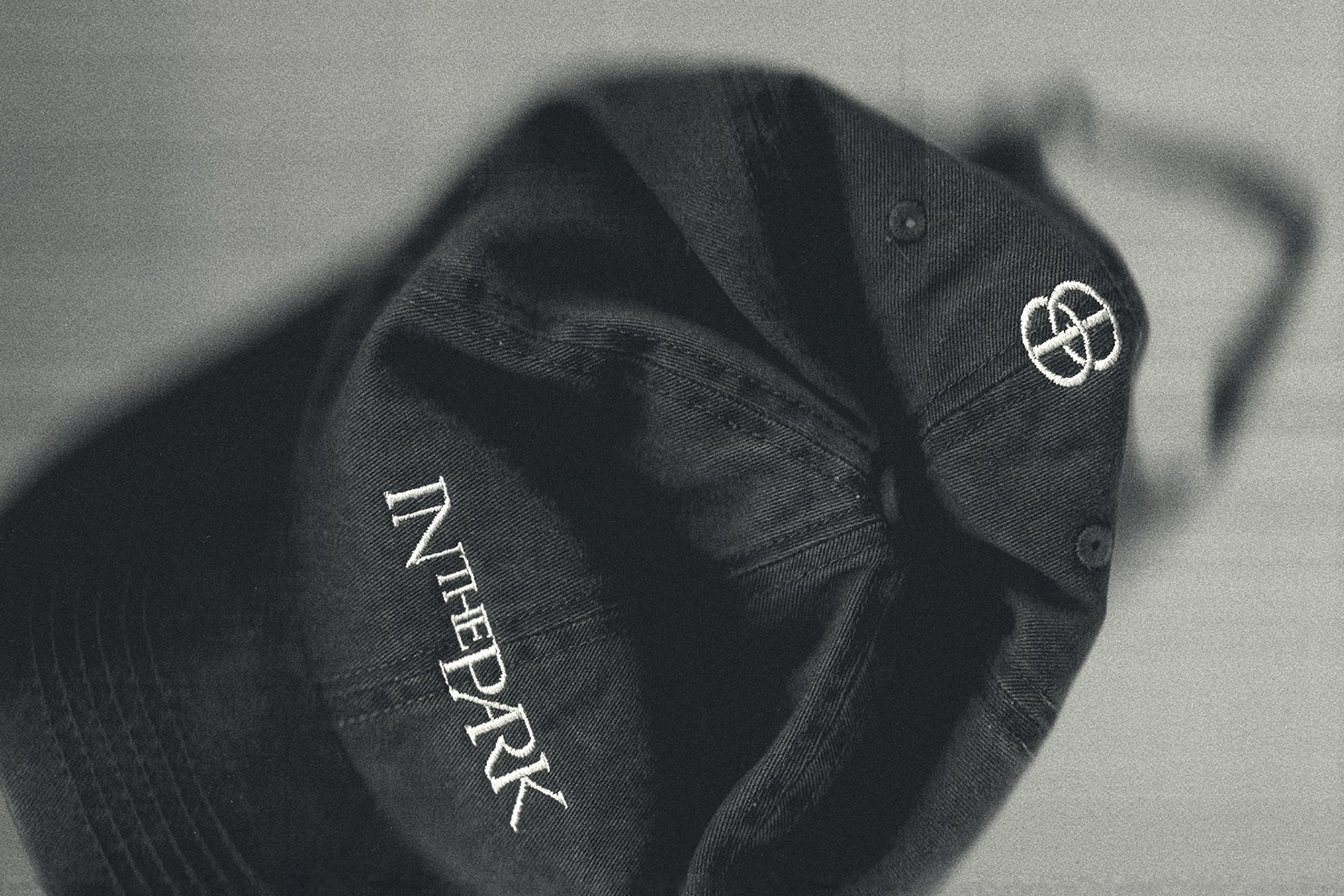
From the logotype, we developed an icon based on the “T,” transformed into two interlocking circles. The gesture is simple, but loaded with meaning: connection, mutual support, and the protective architecture of a shared community. It distills the agency’s philosophy into a visual signature.
To further personalize the identity, we integrated handwritten elements throughout that bring individuality to the forefront.
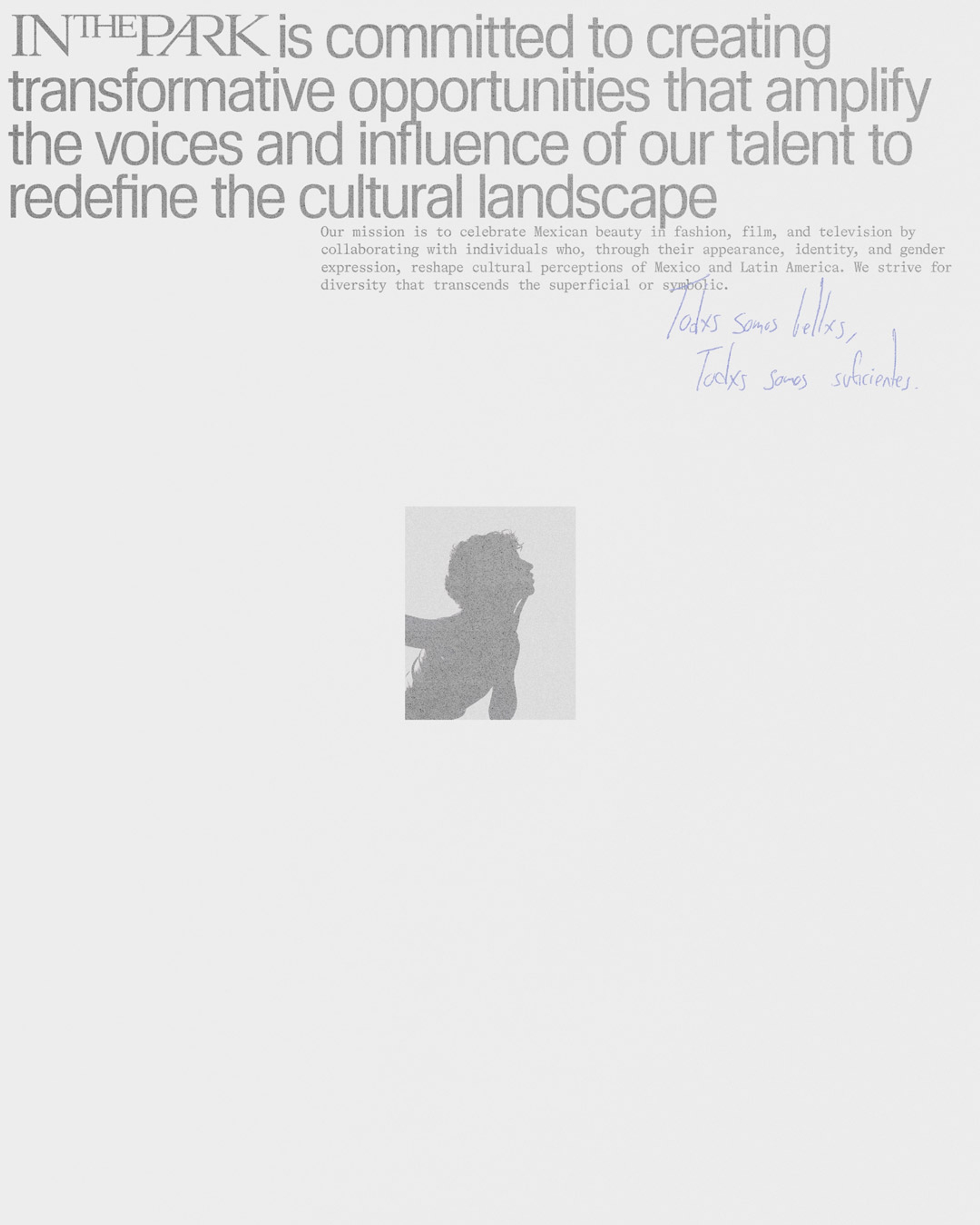

Handwritten signatures and personal notes reinforce the agency’s ethos: talent is not just seen, but known.
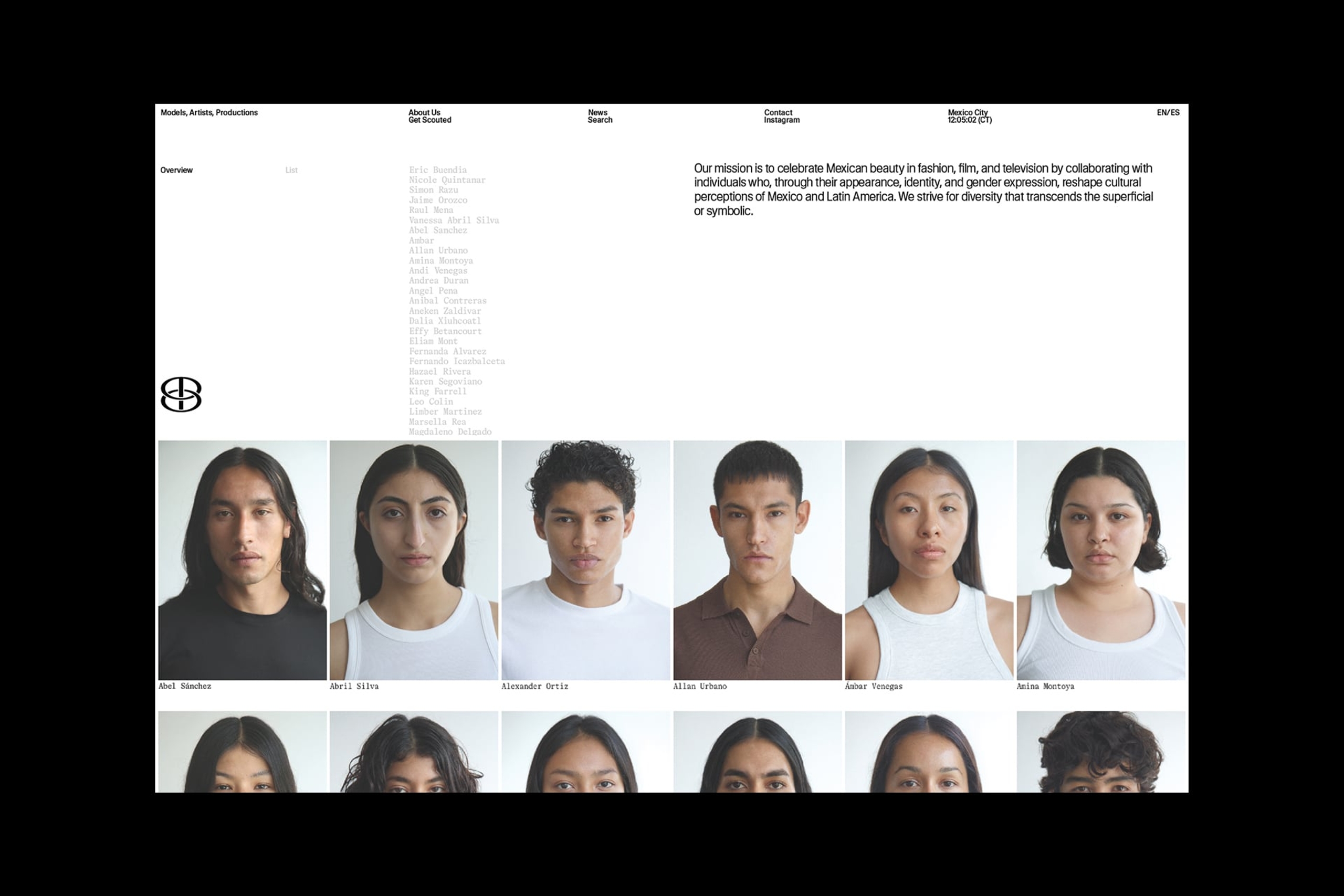
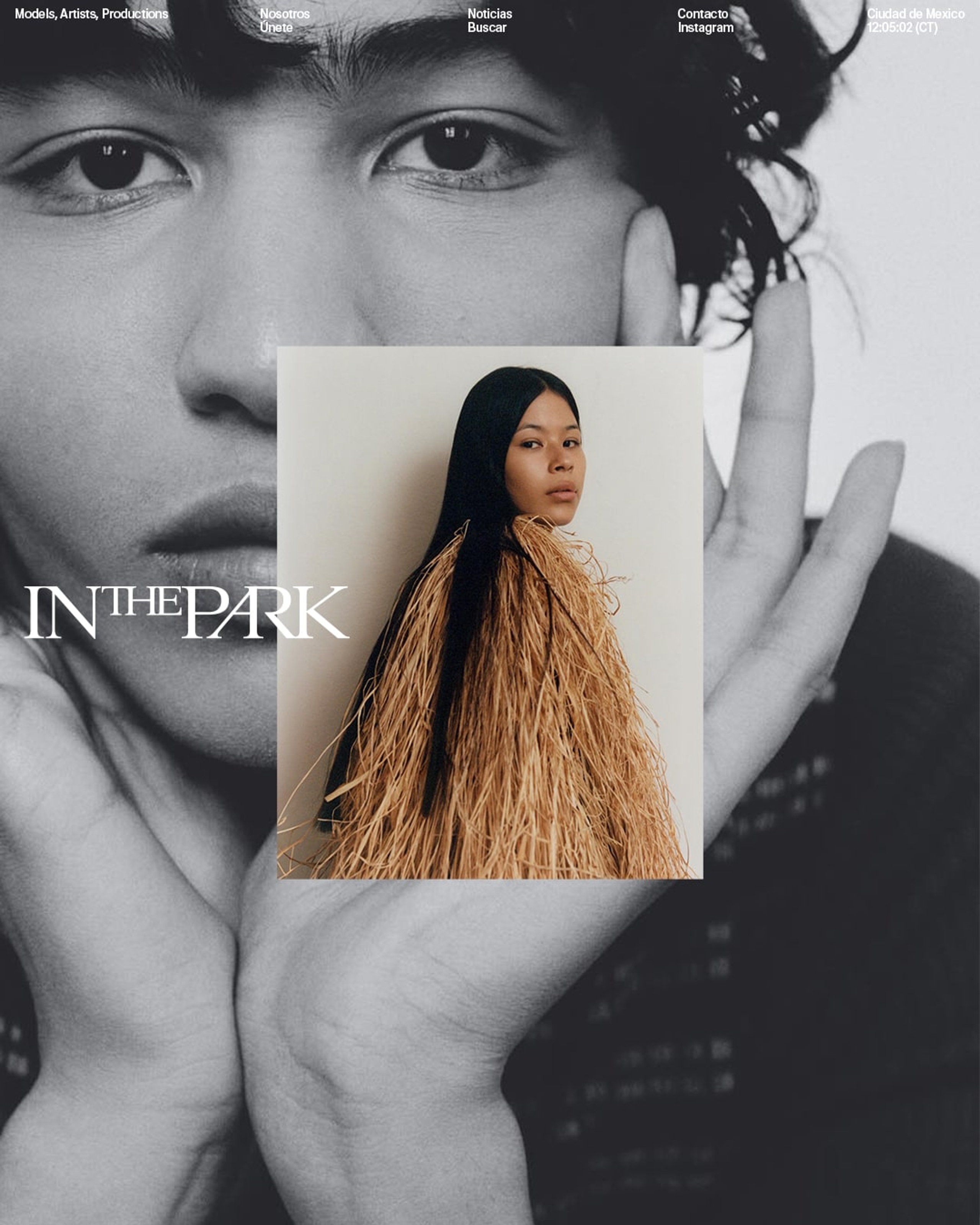
Website
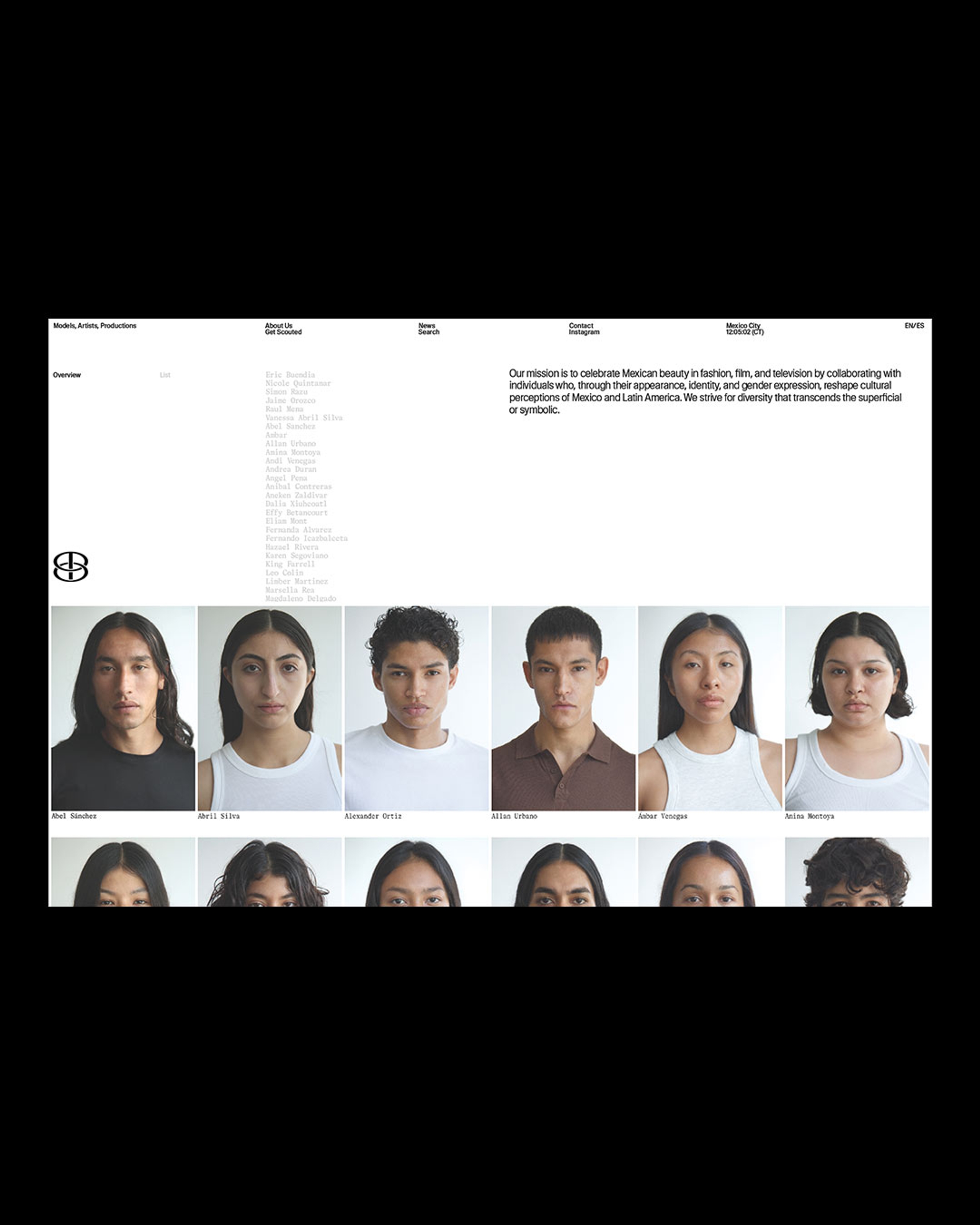
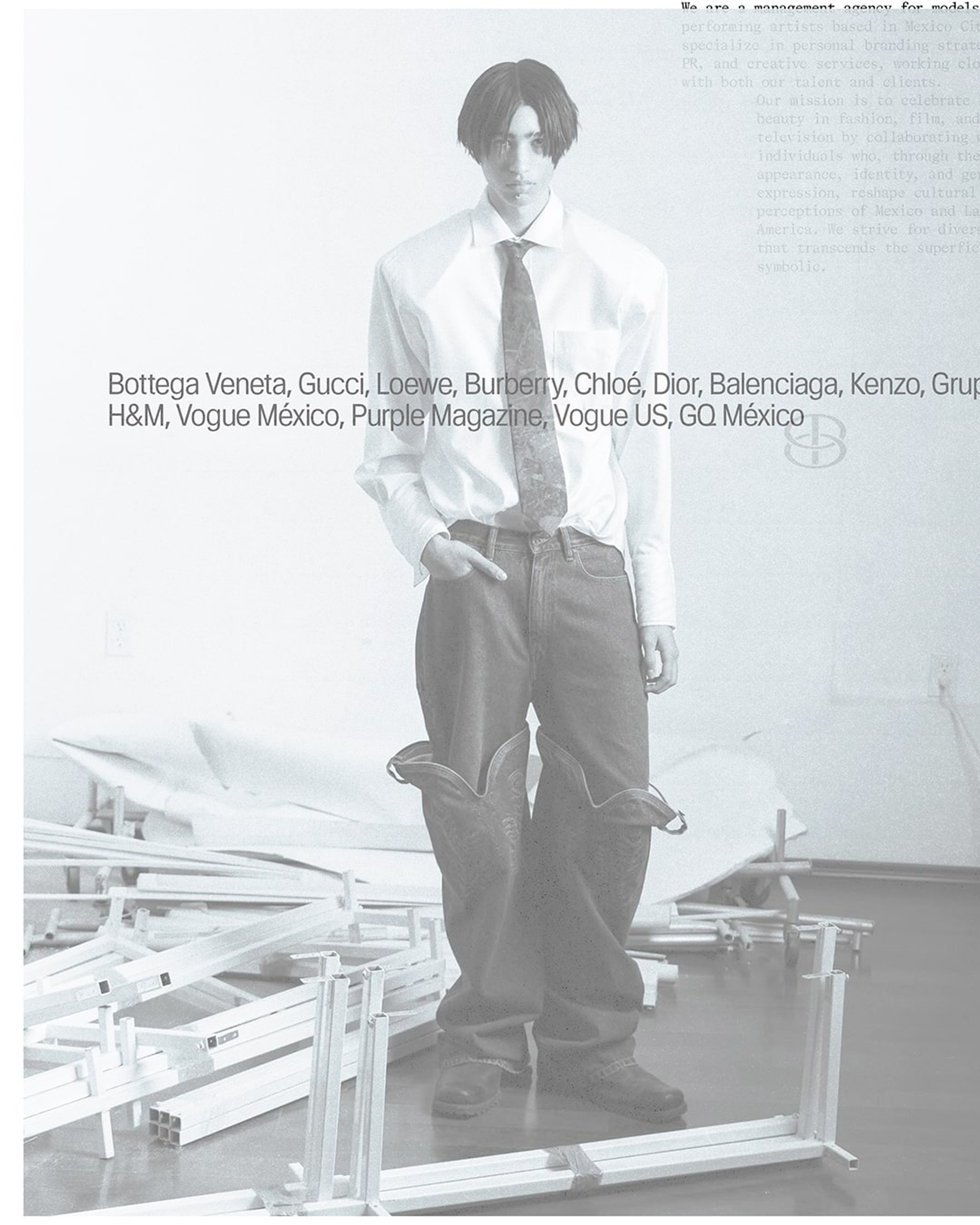
The website extends the identity into an immersive digital space. Motion graphics and interactive layouts add energy to the experience, while an austere, tactile interface keeps the focus on the people represented. Each profile is designed to feel distinct, adapting to the individuality of the talent rather than forcing them into a rigid template.
Clean and minimal, yet expressive, the site gives In The Park a digital home that feels both elevated and alive. It also carries the agency’s belief that talent should be nurtured, championed, and treated with dignity.
"BonTemps didn’t just understand the essence of In The Park, they amplified our values. Our brand now feels stronger, more elevated, and fully aligned with our vision."
Carlos Castellanos
Founder & Director
Designed to be both distinctive and adaptable, our work set the foundation for an agency that amplifies the voices of its talent while reimagining representation.
+Visit WebsiteProject Recap
Talent management is often reduced to logistics. Contracts, bookings, percentages, visibility. For In The Park, representation means something more human: a commitment to advocacy, protection, and the recognition of talent as whole individuals.
The name itself carries deep significance. A park is public, but also protective. A place for gathering, movement, refuge, and belonging. For founder Carlos Castellanos, it became a way to frame the agency as both a sanctuary and a platform, a space where talent could be seen, supported, and allowed to grow.
Our work focused on translating that sense of care into a brand system with enough authority to represent serious talent, and enough warmth to make each individual feel known. A custom serif wordmark feels intimate and commanding in equal measure. Organic flourishes within the letterforms suggest nature, connection, and growth, while the overall structure gives the agency a sense of stature and legacy.
The website extends the identity into an immersive digital space. Motion graphics and interactive layouts bring energy to the experience, while an austere, tactile interface keeps the focus on the people represented. Each profile is designed to feel distinct, adapting to the individuality of the talent rather than forcing them into a rigid template. Clean and minimal, yet expressive, the site gives In The Park a digital home that feels both elevated and alive.
We created a brand world built around protection, advocacy, and belonging. The result is an identity and website that feels personal without losing authority, refined without being cold, and structured without losing humanity.
Services
Brand Identity
Web Design
Motion Identity
Copywriting
Custom Typeface
Waldenburg
by Kimera Corp
LL Bradford Mono
by Lineto
BonTemps Team
Creative Direction:
BonTemps©Agency
Design:
Albert Mestres
Mauro Bonillo
Sebastián Patiño
Motion:
John Vallance
José Cohen
Diego Herrera
Copywriting:
John Vallance
Collaborators
Programming:
Federico Salort
Related Projects