Saint,
Artisanal baking meets contemporary design, bridging the bucolic and the refined.
(Services)Brand IdentityCampaignPhotography


An identity that balances the organic and studied, the artisanal and urban, the provincial and composed.
Context
If you’ve ever dined at a trendy restaurant in Mexico City and ordered a side of bread, there’s a fair chance that the sumptuous slices with perfect crust that arrived at your table were from Saint Bakery. Famous among both locals and tourists as the finest sourdough Mexico City has to offer, Saint supplies bread to the city’s most frequented and chic spots.
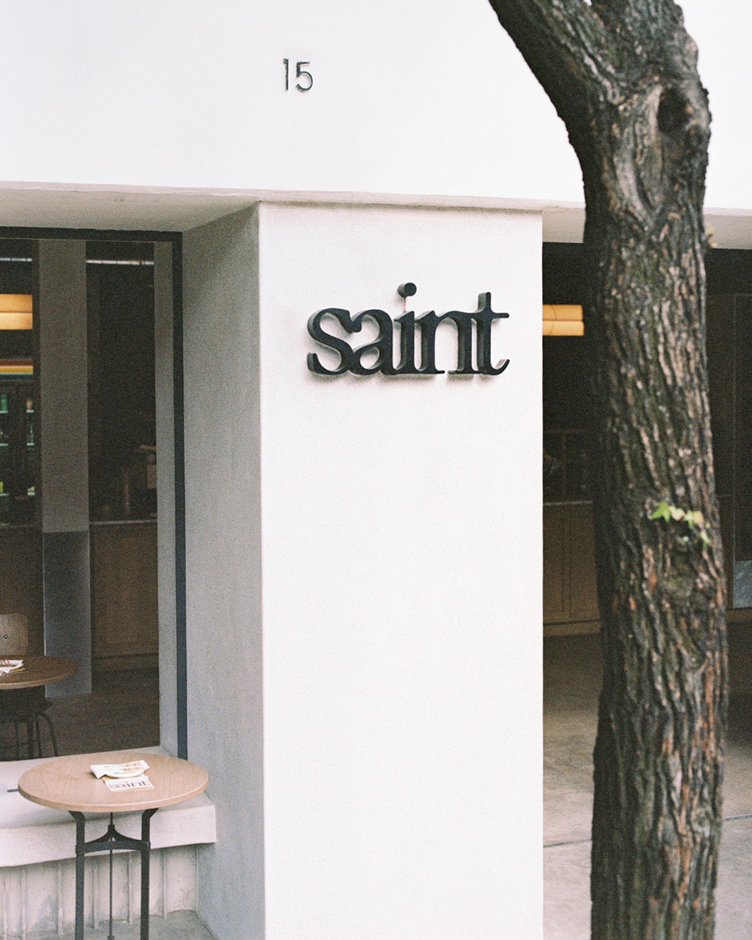
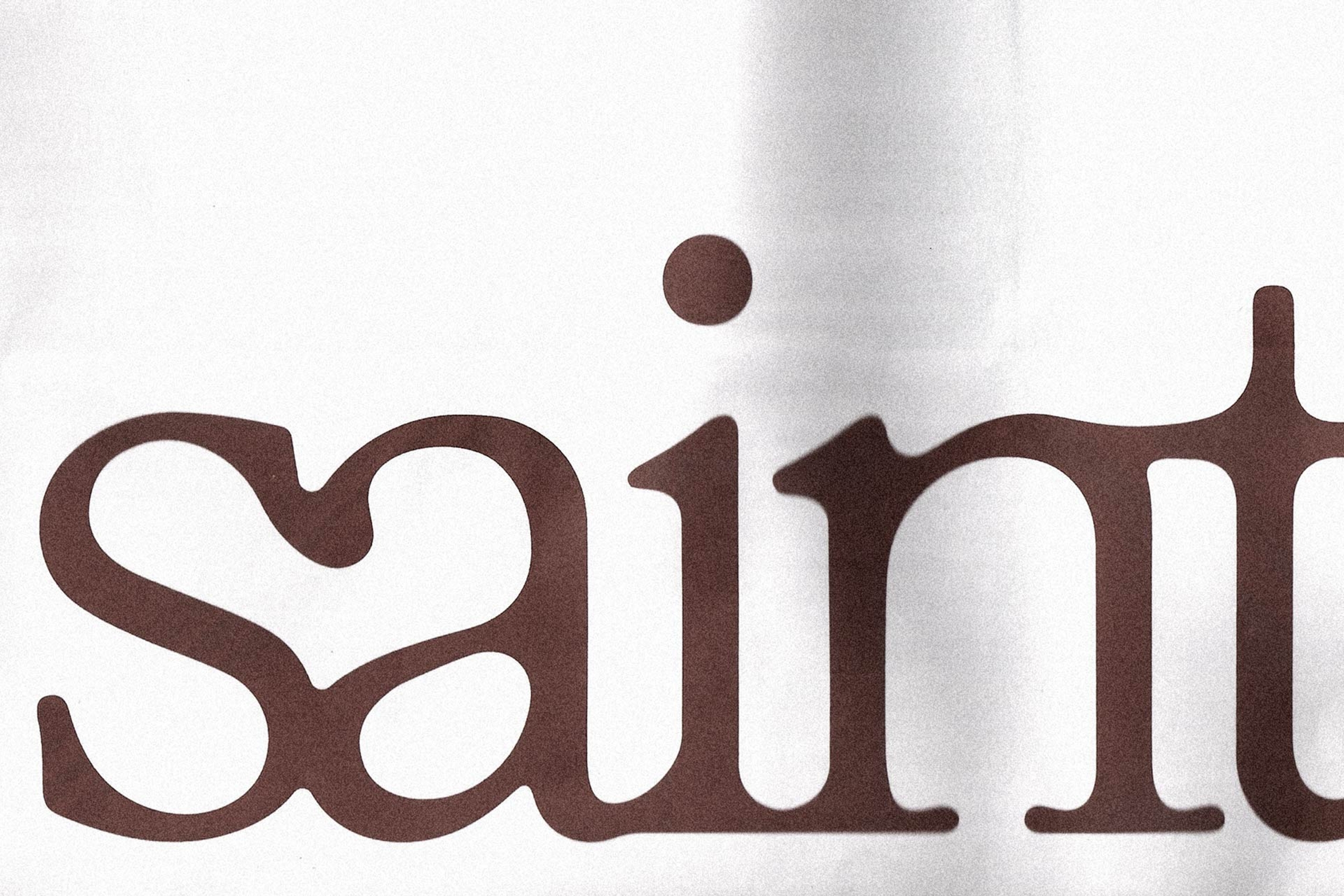
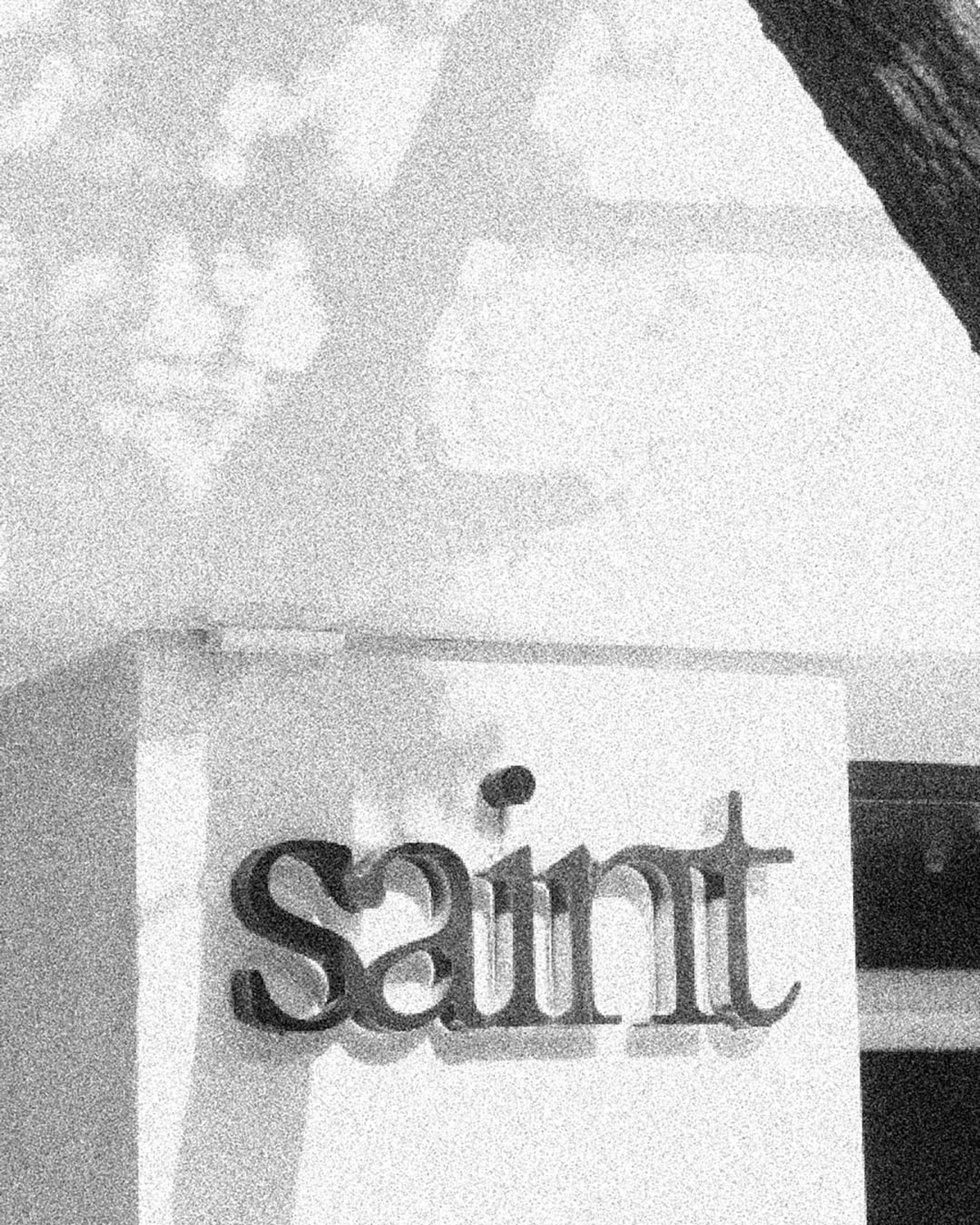
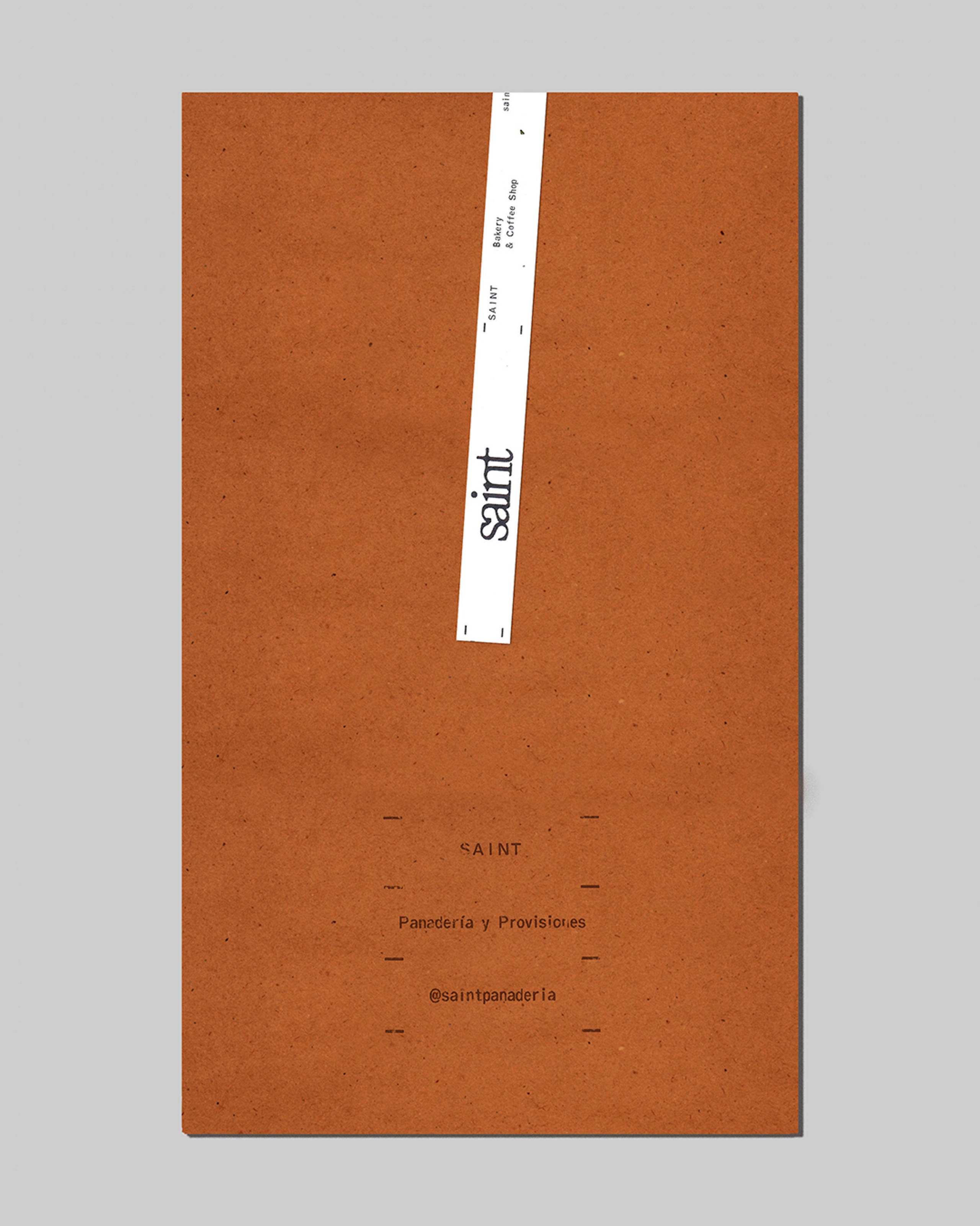
Our task was a holistic rebrand to coincide with the opening of a new production center and cafe location in La San Miguel. We designed an evocative logo reminiscent of the rustic character of the bread to capture the brand’s signature elevated style.
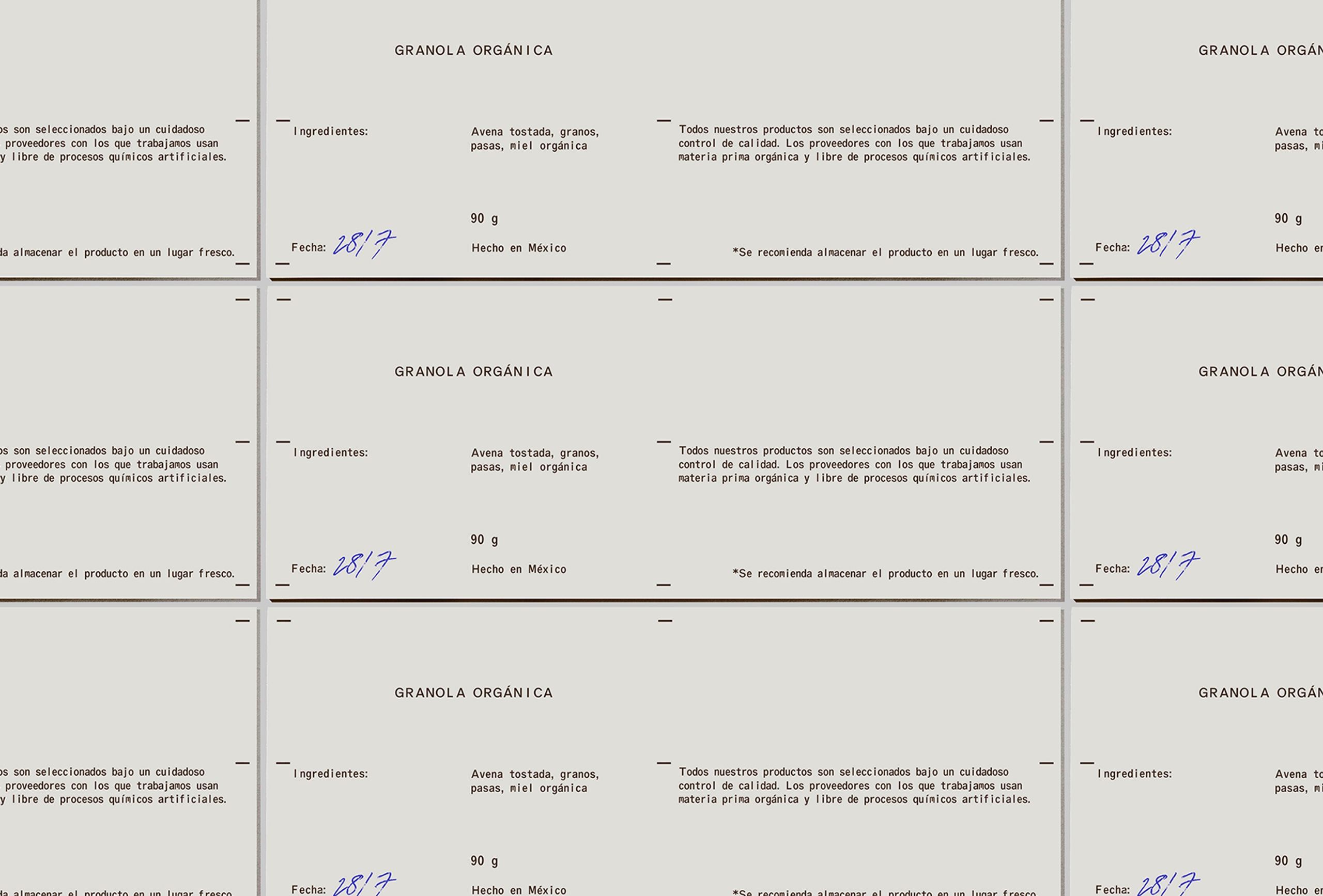
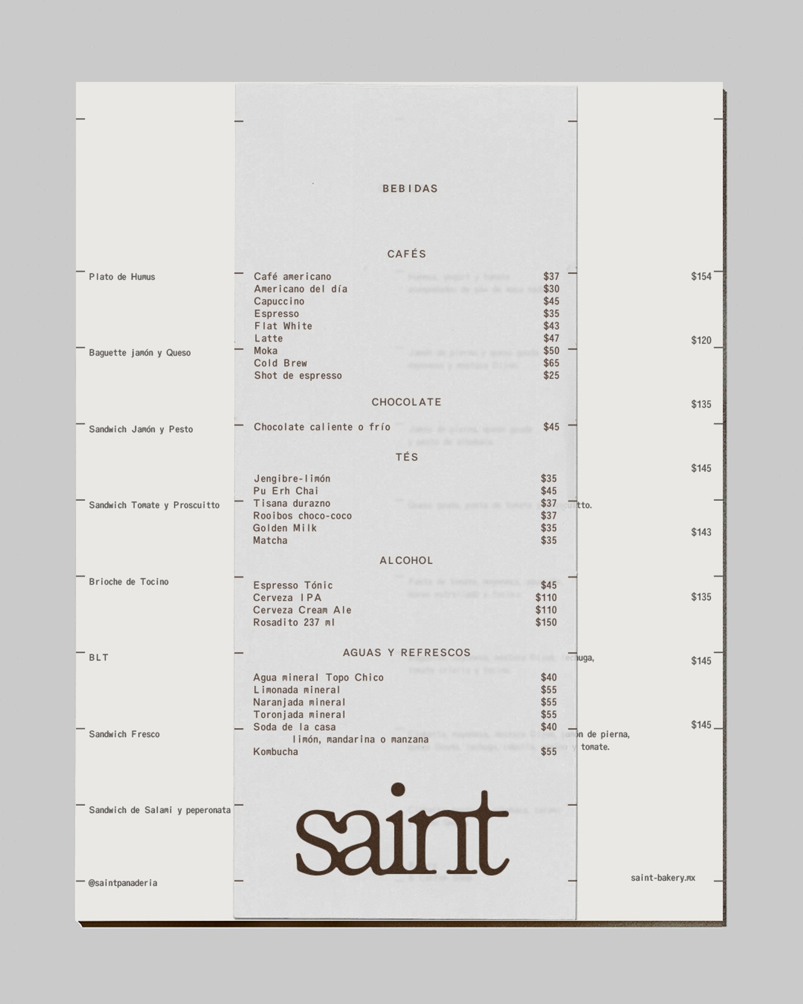
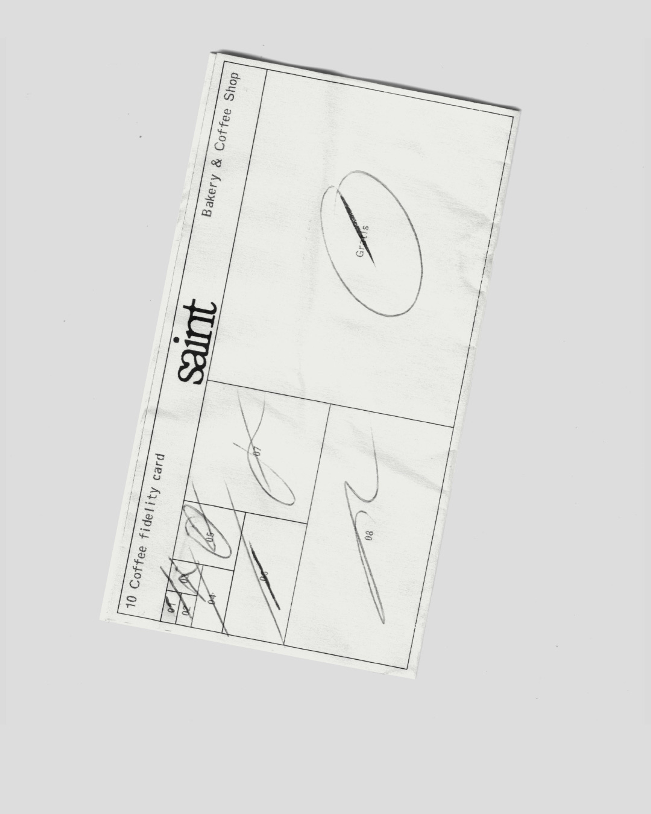
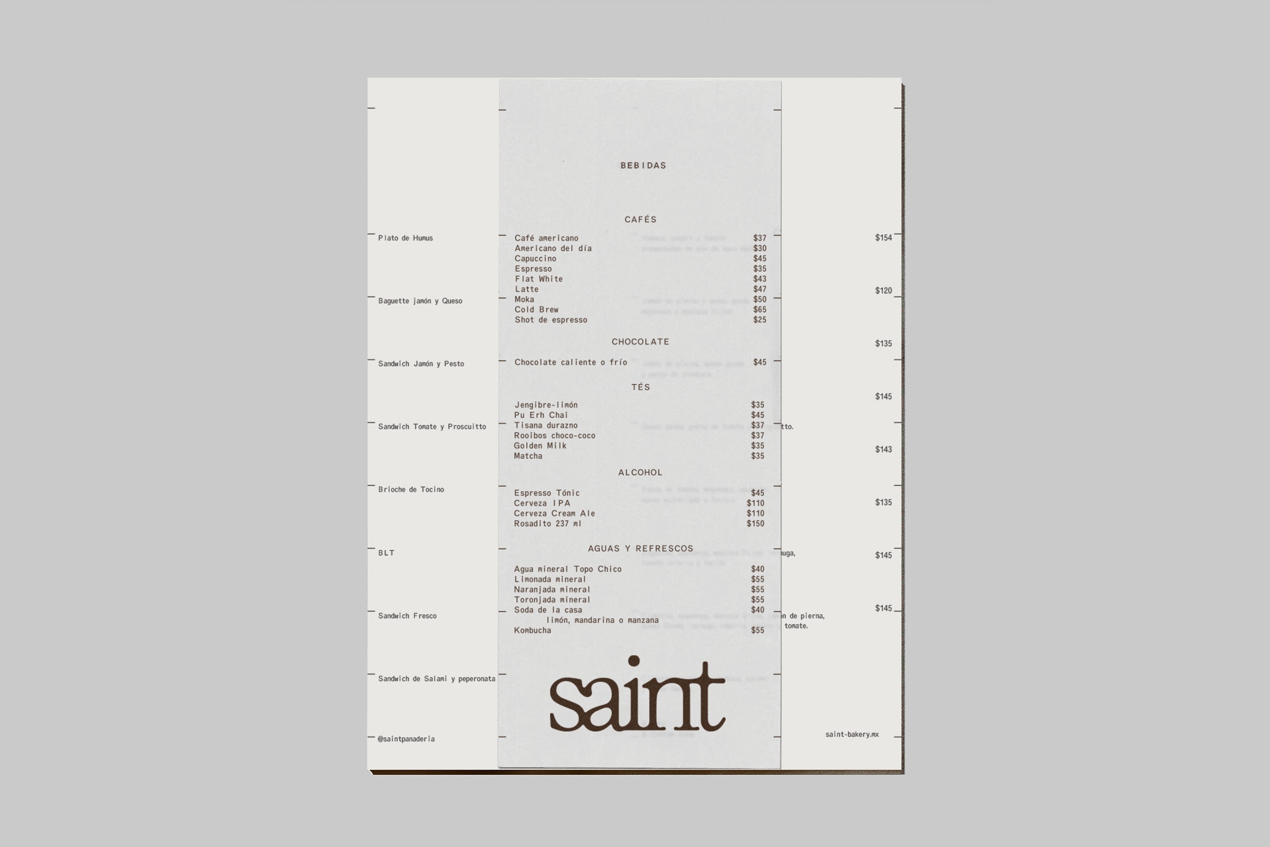
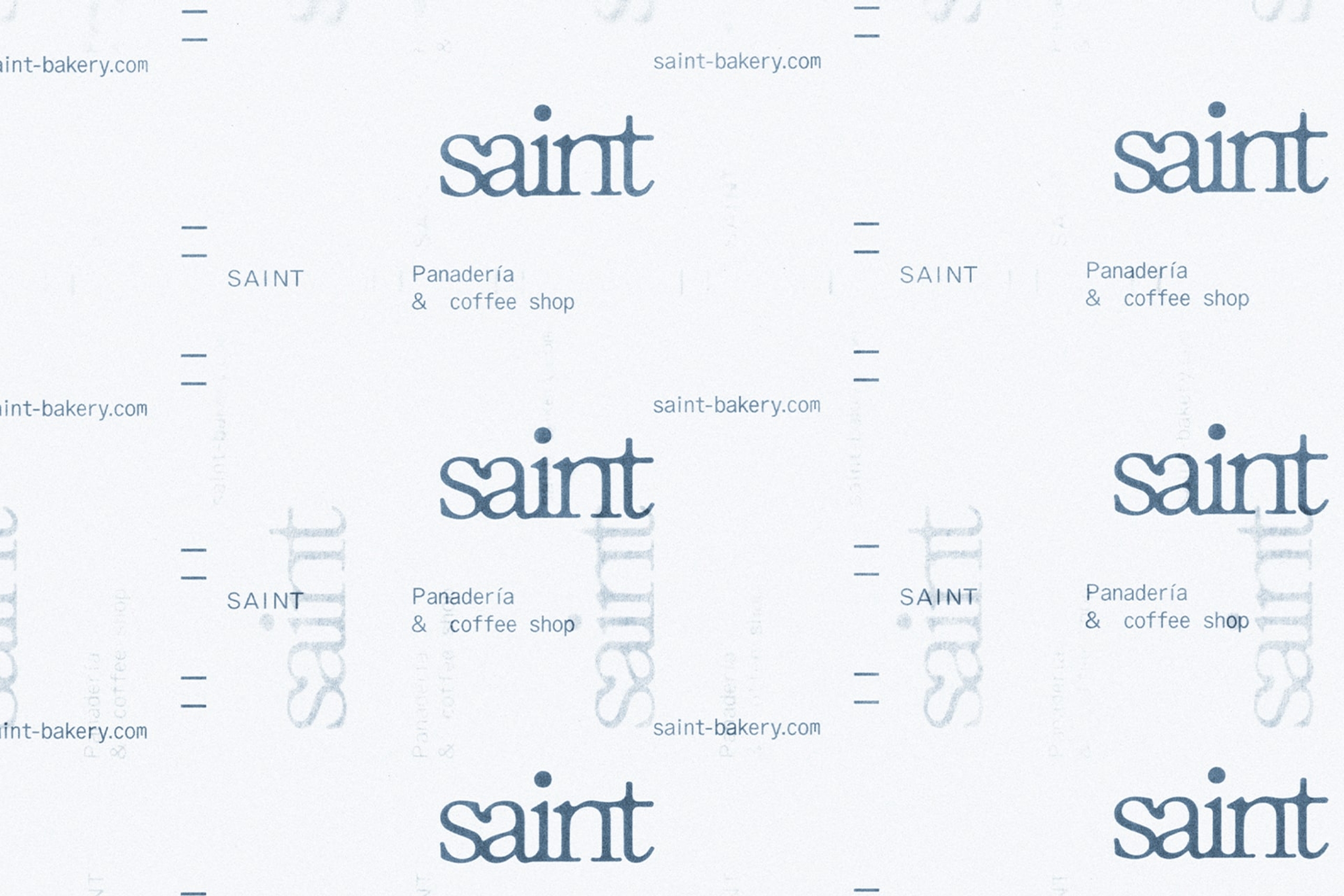
Graphic System
To tell the Saint narrative more completely, we also developed a technical style grid system within which we could place various graphic elements. These layouts have an industrial feeling, and were inspired by the large ovens in which Saint’s meticulously designed delicacies rise to perfection.
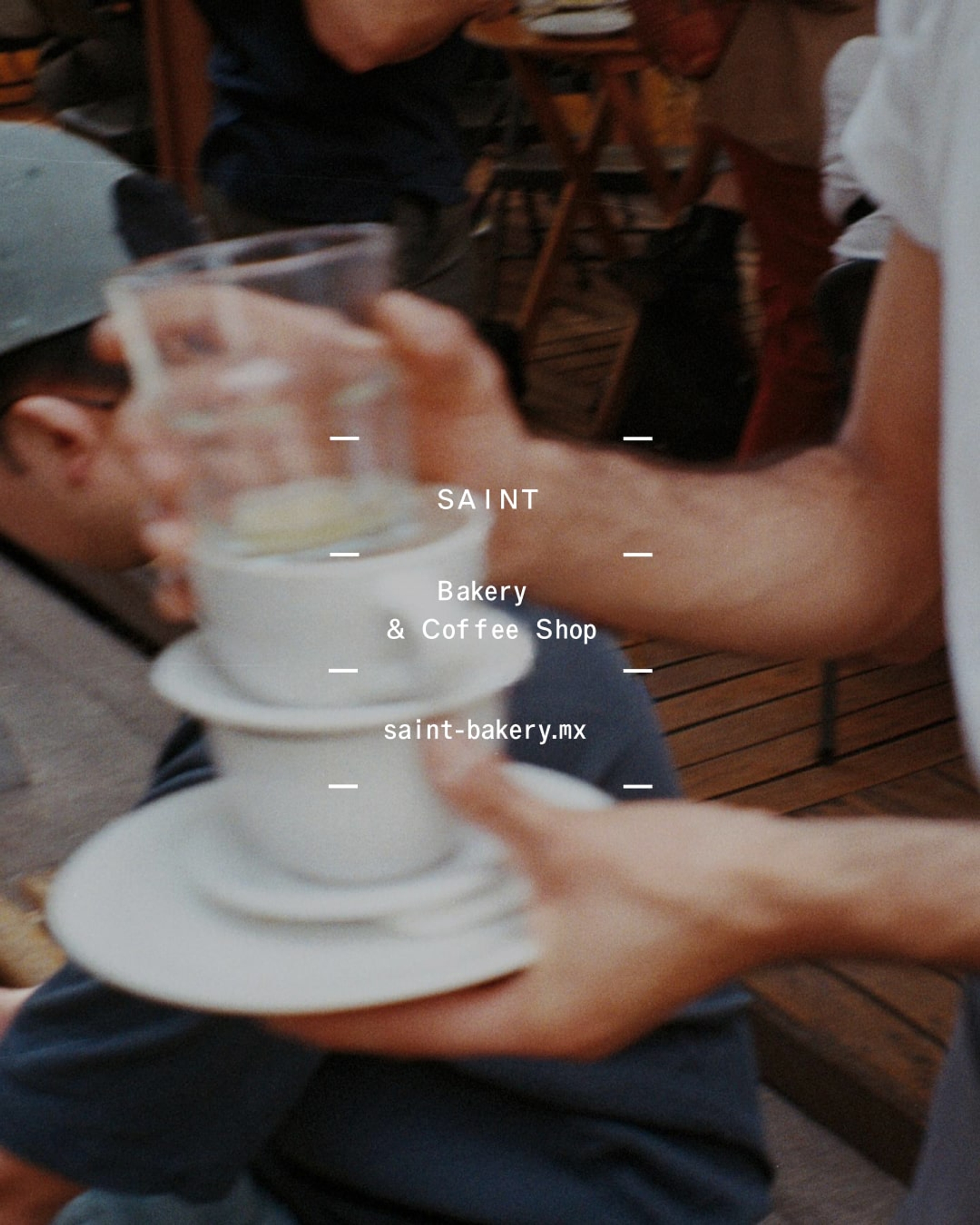
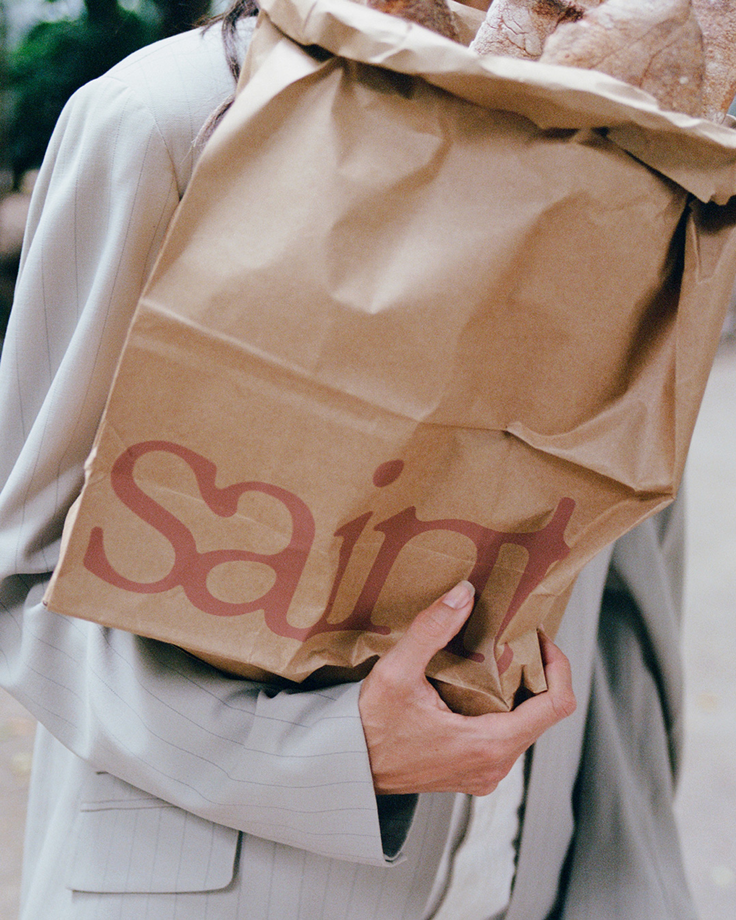
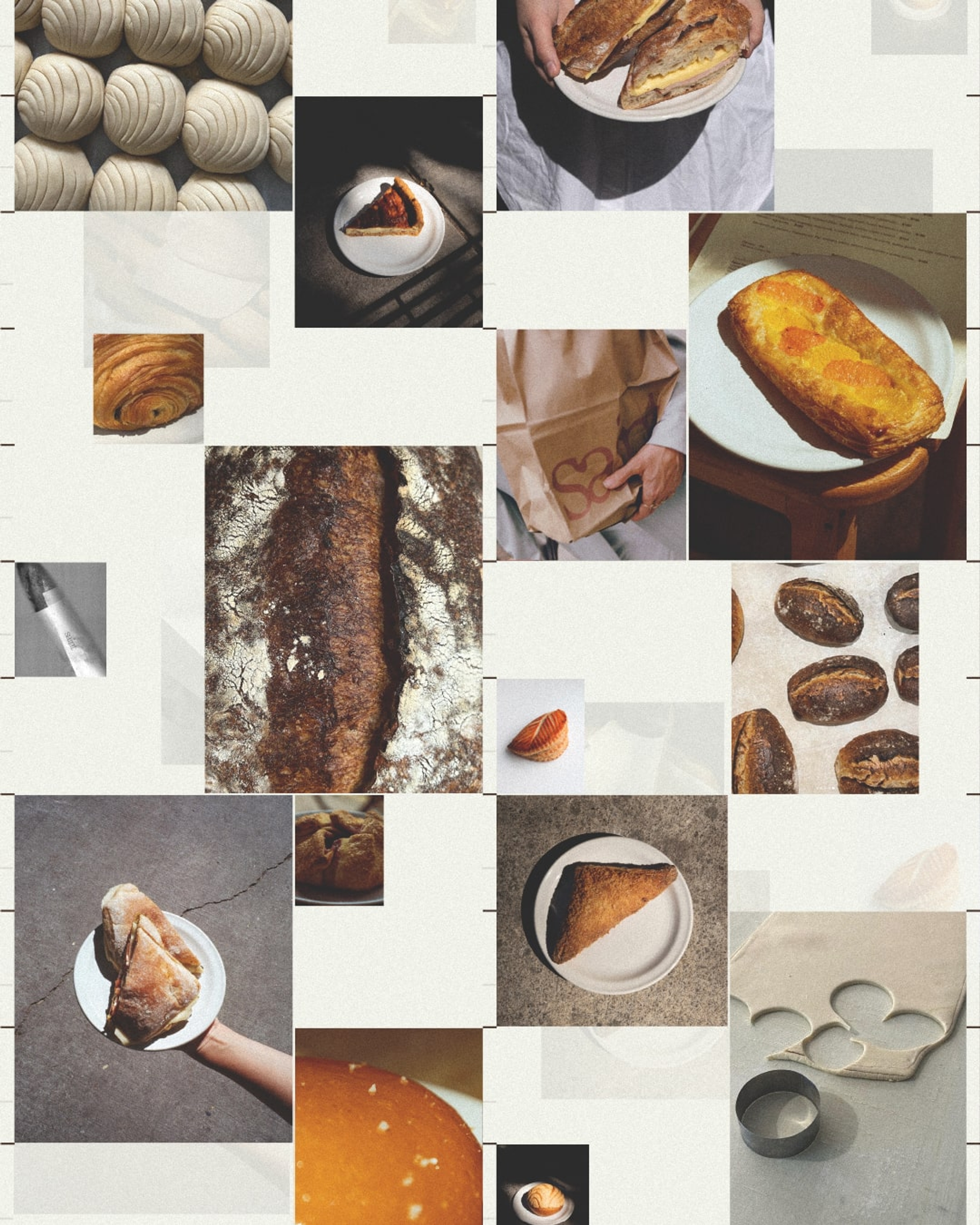
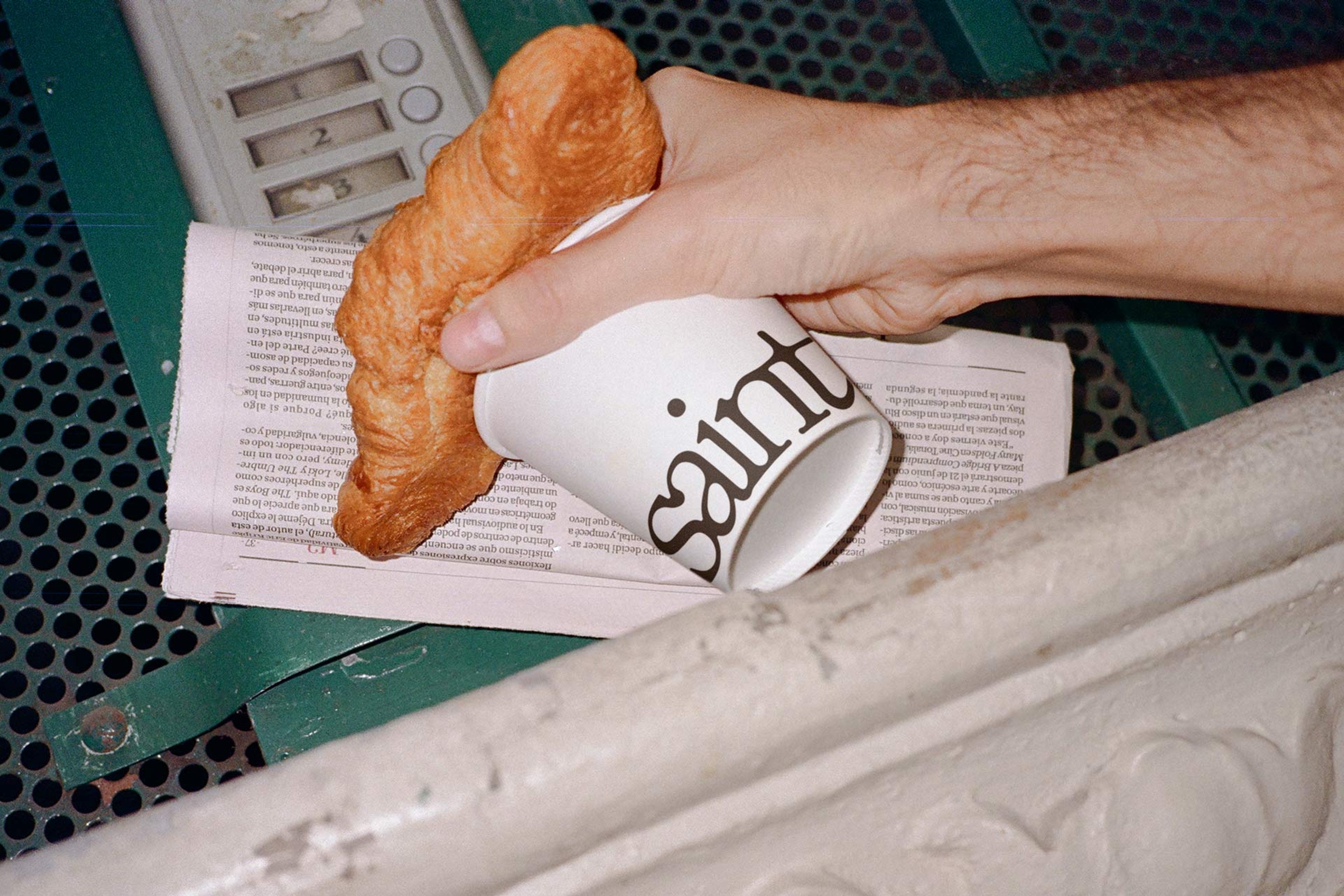
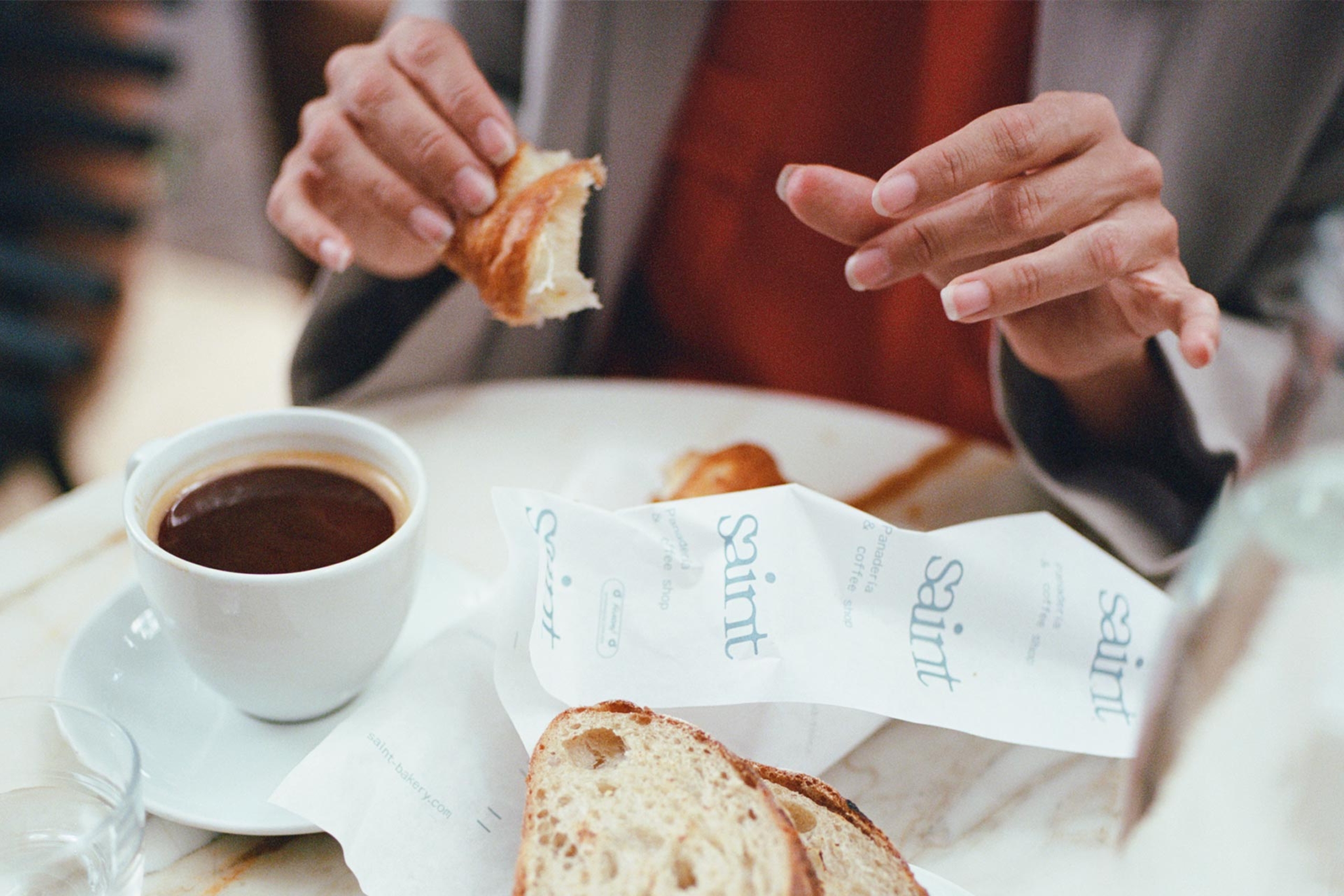
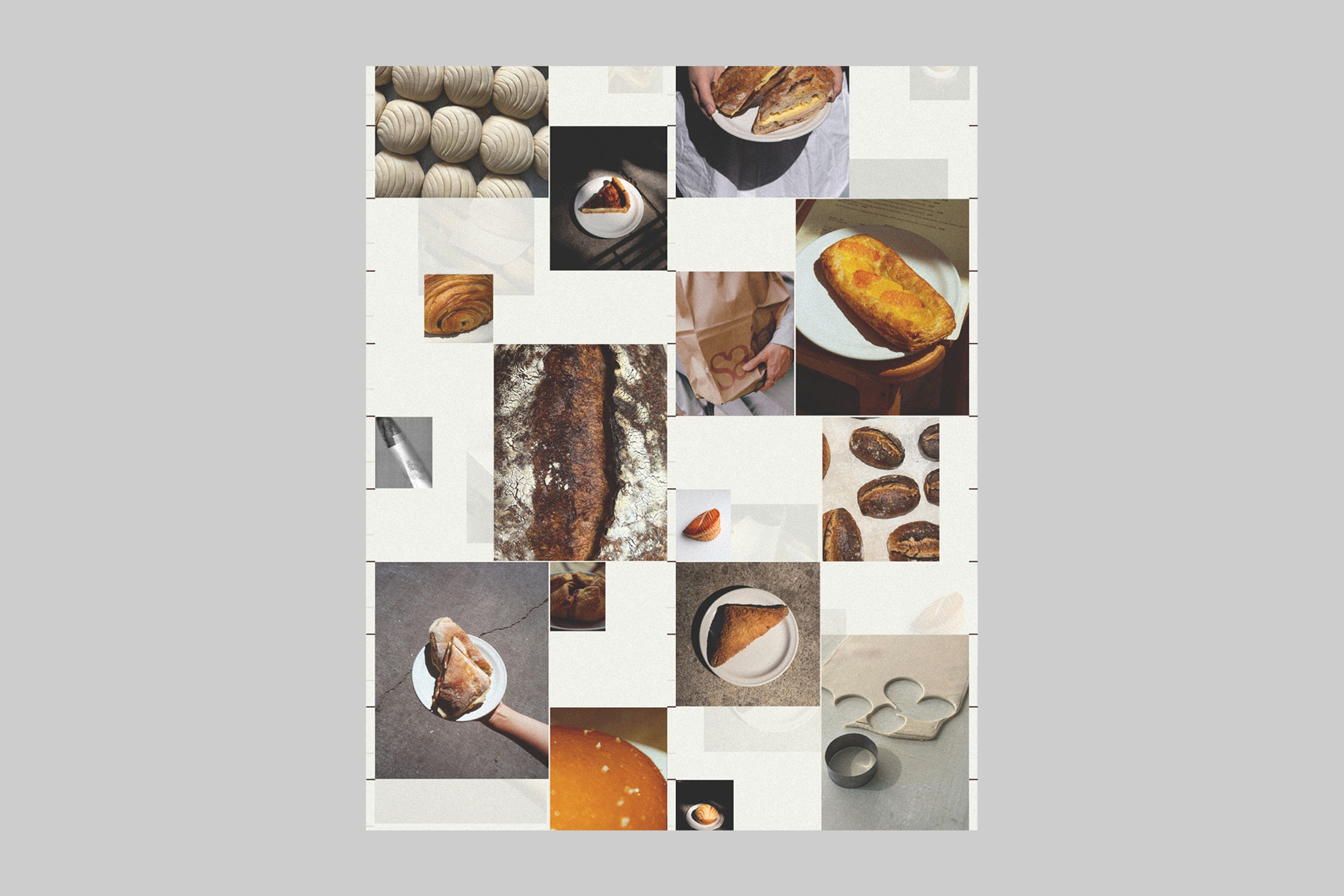
Photography Campaign
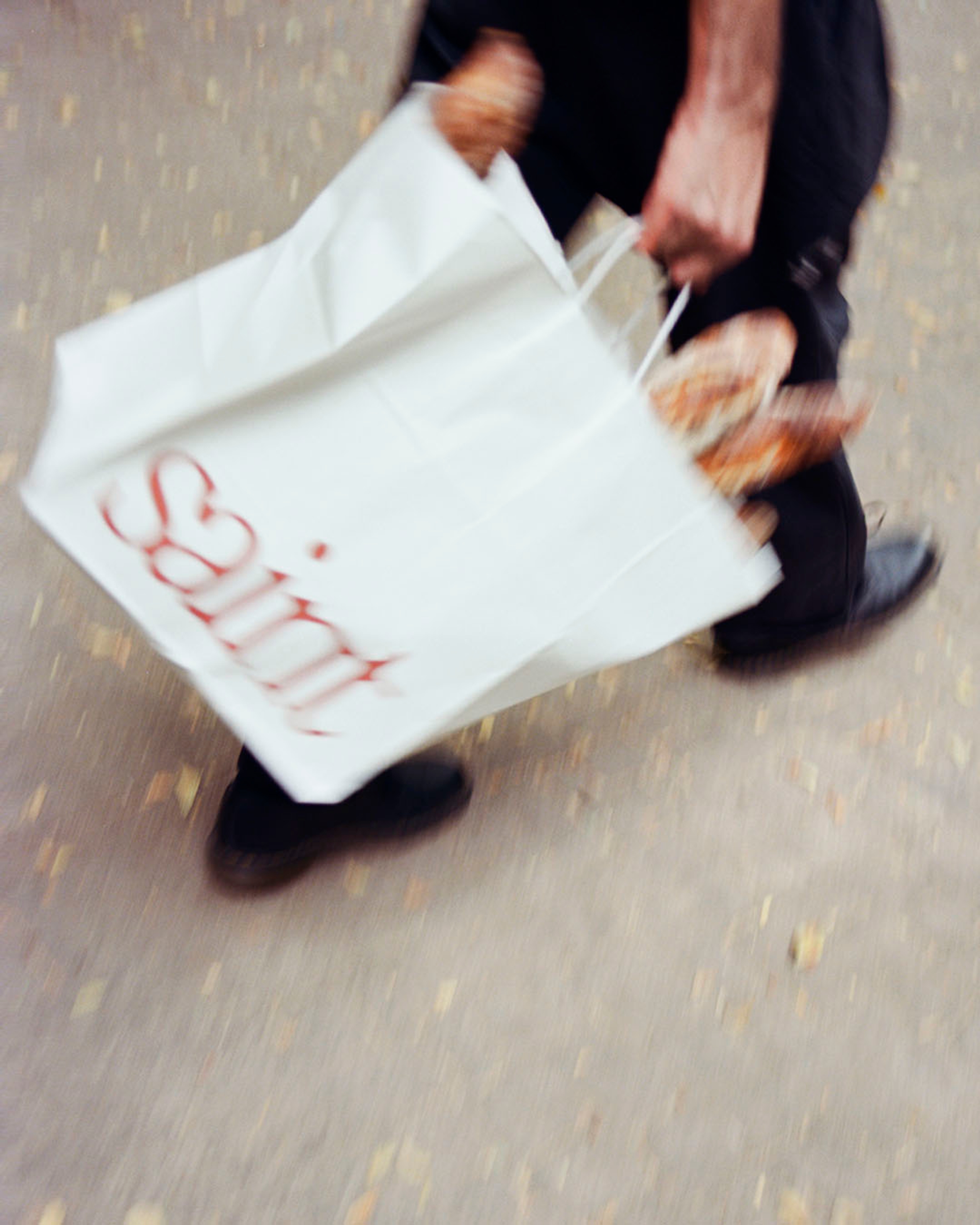
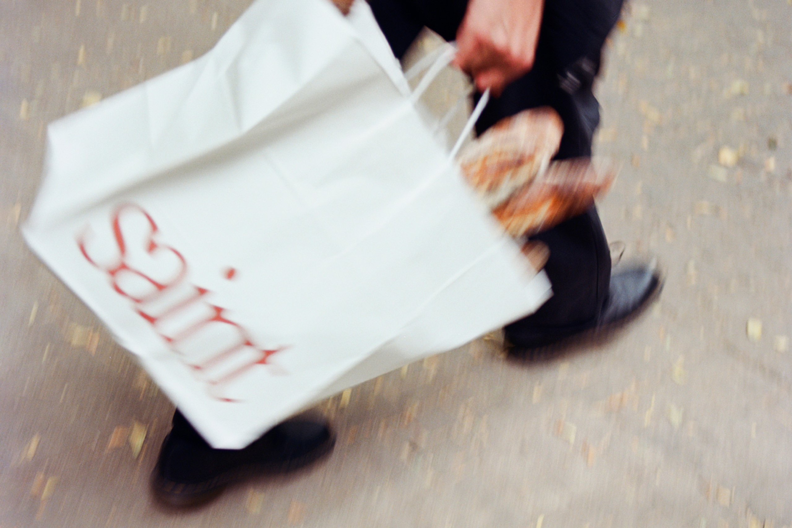
Our photography moves between the casual and the composed, focusing on the quotidian as well as select fashion inspired details. To properly convey this mix of everyday and fantasy, we utilized our point & shoot 35mm alongside the precision and clarity of medium format film.
The applications are meant to blend seamlessly into the image, enhancing the visual narrative without overwhelming it, akin to subtle product placement.

An identity that balances the organic and studied, the artisanal and urban, the provincial and composed.
Project Recap
If you’ve ever dined at a trendy restaurant in Mexico City and ordered a side of bread, there’s a fair chance that the sumptuous slices with perfect crust that arrived at your table were from Saint Bakery. Famous among both locals and tourists as the finest sourdough Mexico City has to offer, Saint supplies bread to the city’s most frequented and chic spots.
Our task was a holistic rebrand to coincide with the opening of a new production center and cafe location in La San Miguel. We designed an evocative logo reminiscent of the rustic character of the bread to capture the brand’s signature elevated style.
To tell the Saint narrative more completely, we also developed a technical style grid system within which we could place various graphic elements. These layouts have an industrial feeling, and were inspired by the large ovens in which Saint’s meticulously designed delicacies rise to perfection.
Our photography moves between the casual and the composed, focusing on the quotidian as well as select fashion inspired details. To properly convey this mix of everyday and fantasy, we utilized our point & shoot 35mm alongside the precision and clarity of medium format film.
Services
Brand Identity
Campaign
Photography
Custom Typeface
Oracle
by Dinamo Typefaces
BonTemps Team
Creative Direction:
BonTemps©Agency
Design:
Albert Mestres
Mauro Bonillo
Photography:
John Vallance
Collaborators
Additional Photography:
Julia Badosa
Model:
Isabel Abascal
Related Projects