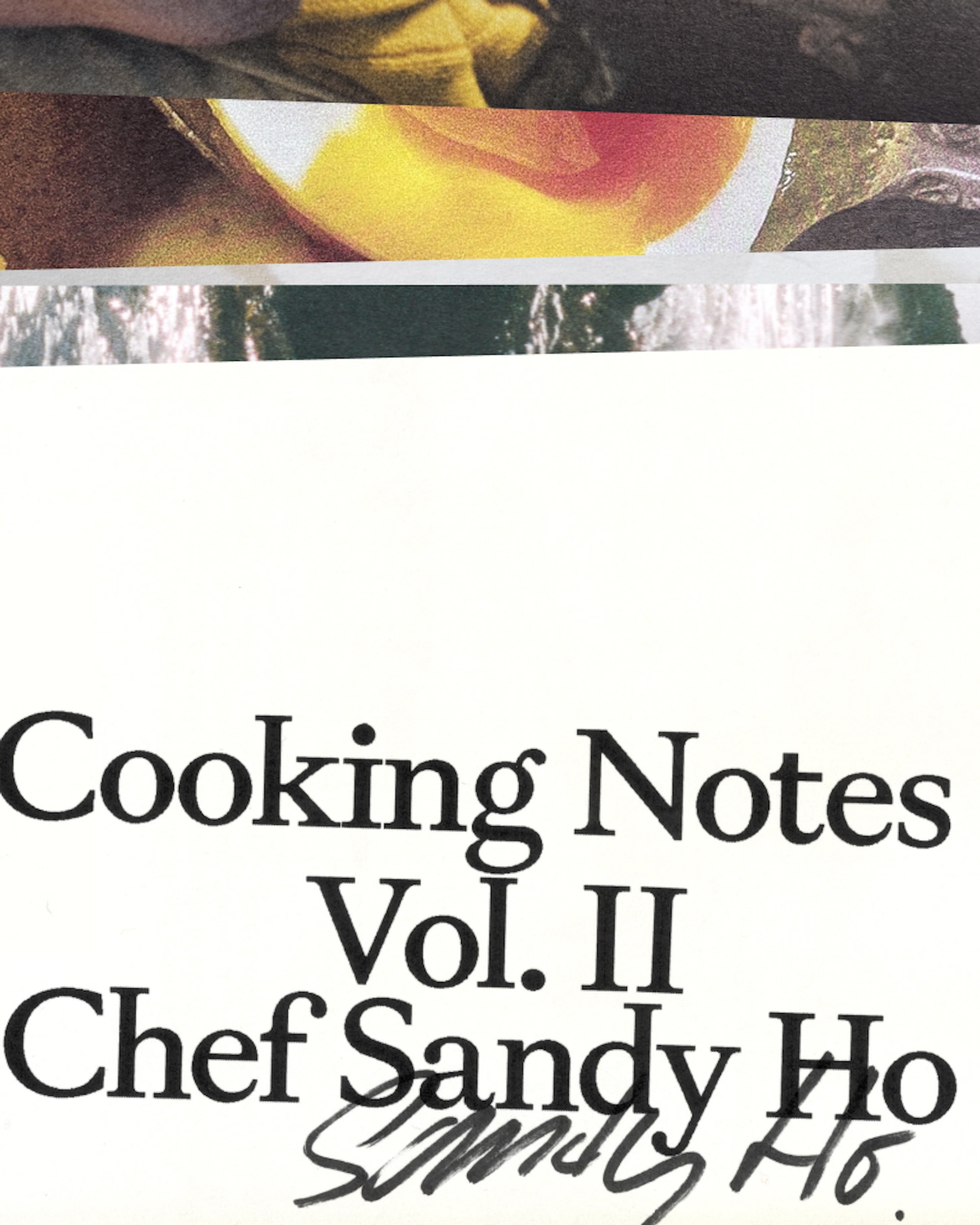
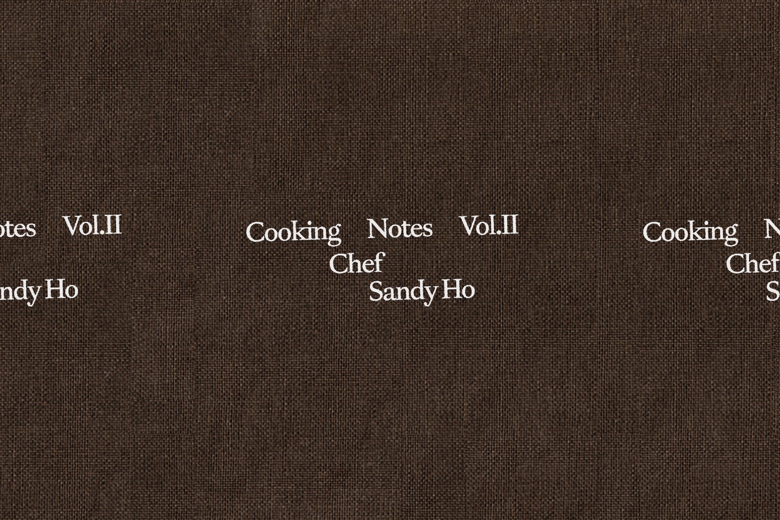
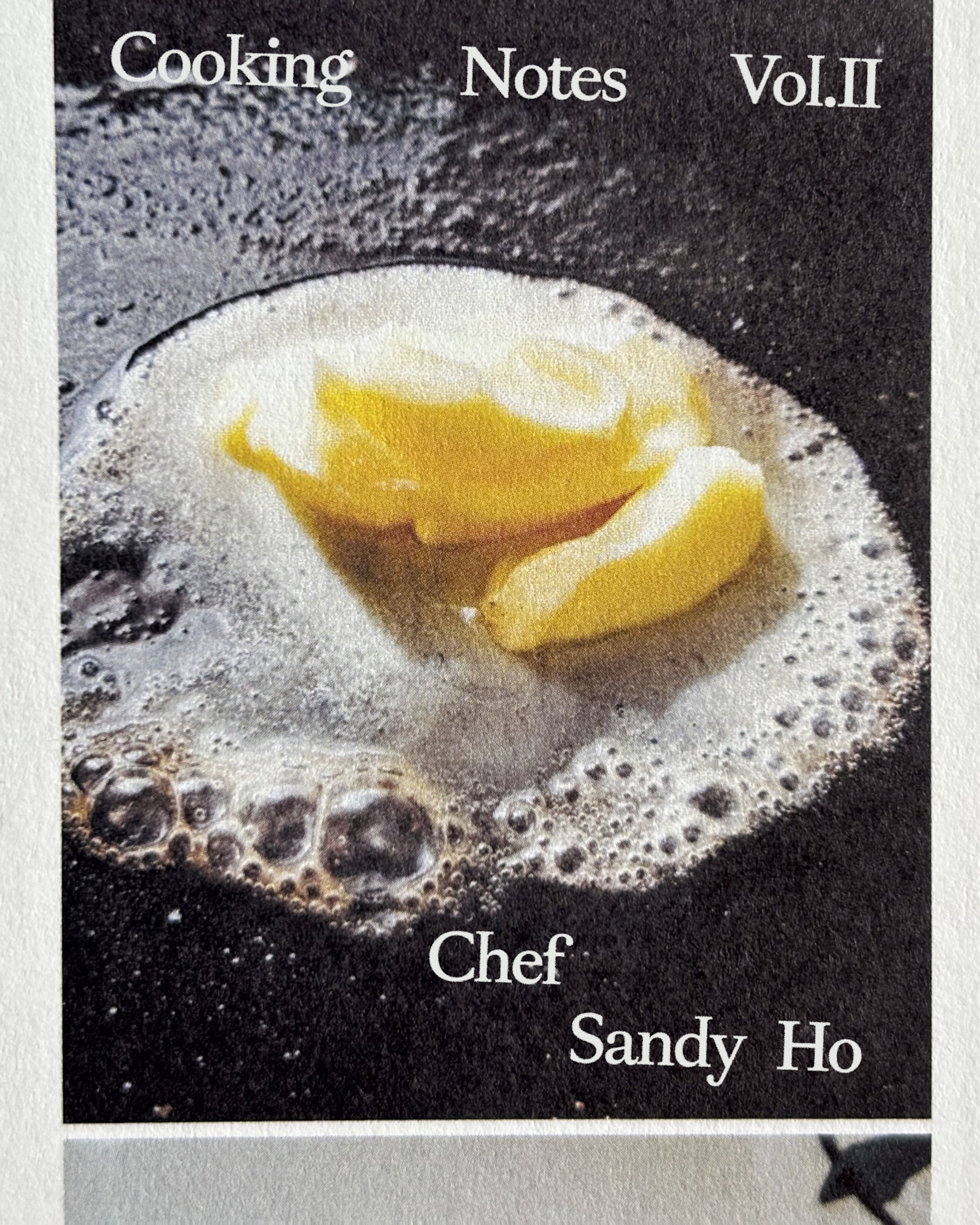
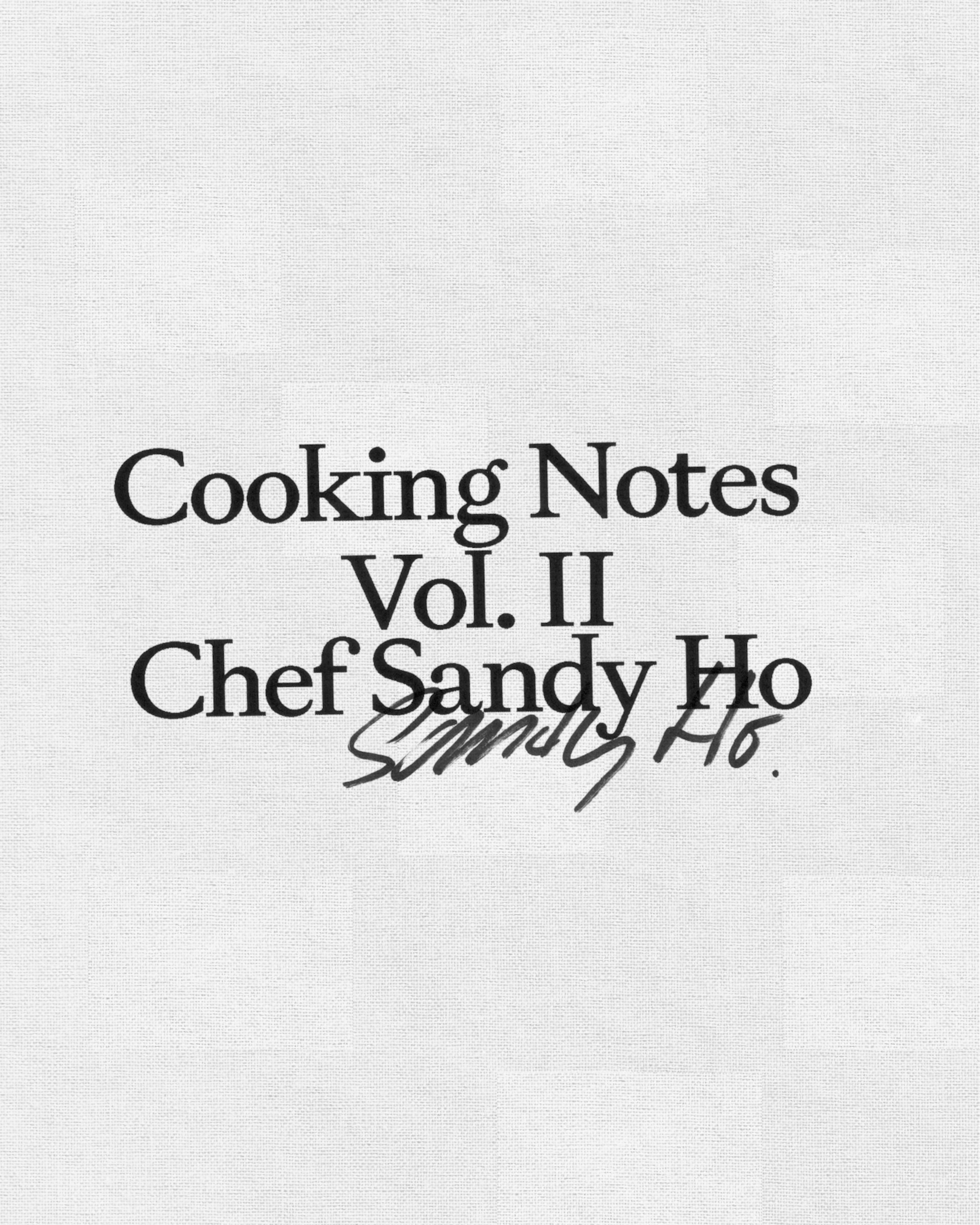
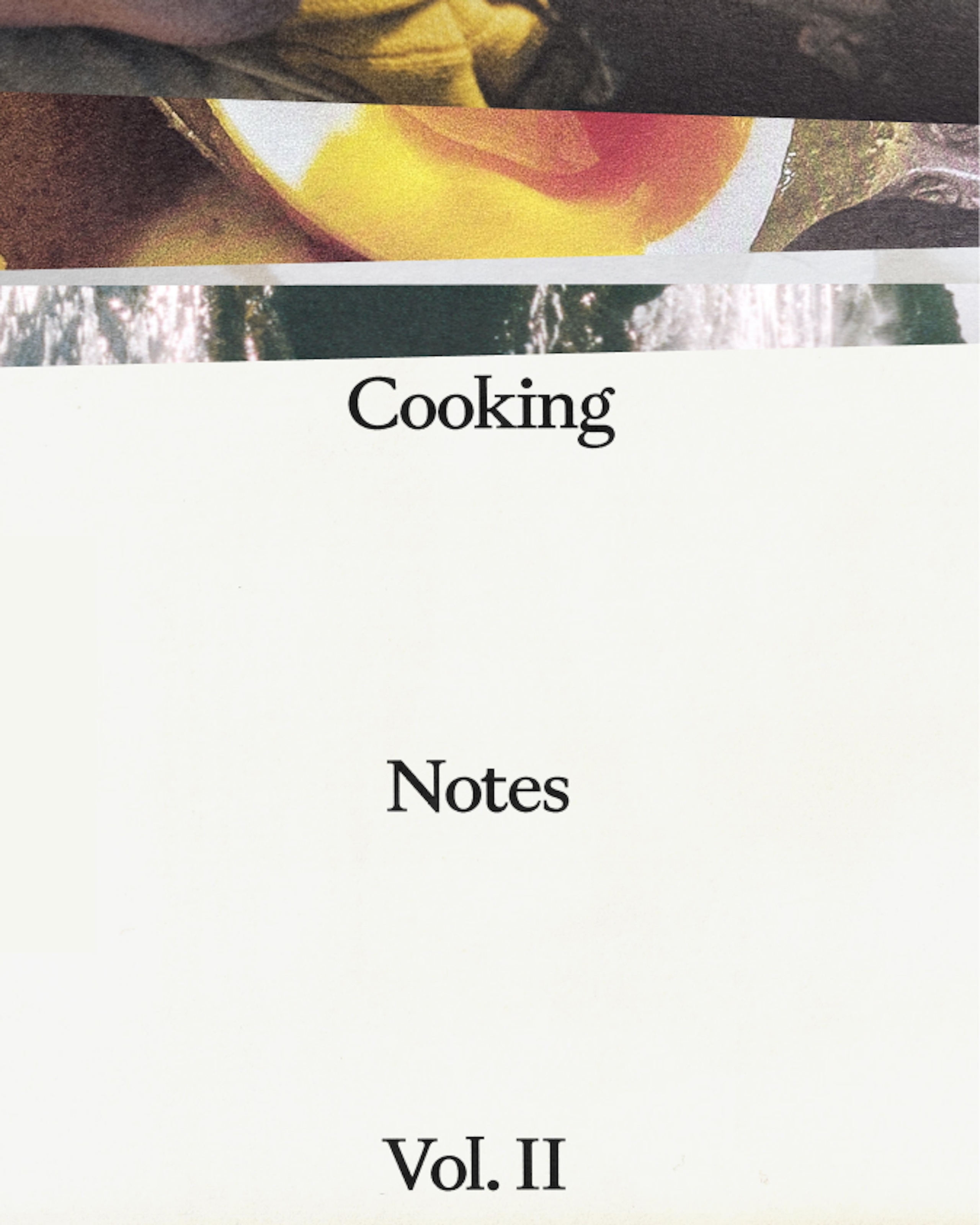
Cooking Notes Vol. II,
An intricate, meditative cookbook tracing Sandy Ho’s lifelong connection to water.
(Services) Book DesignCreative DirectionPhotography
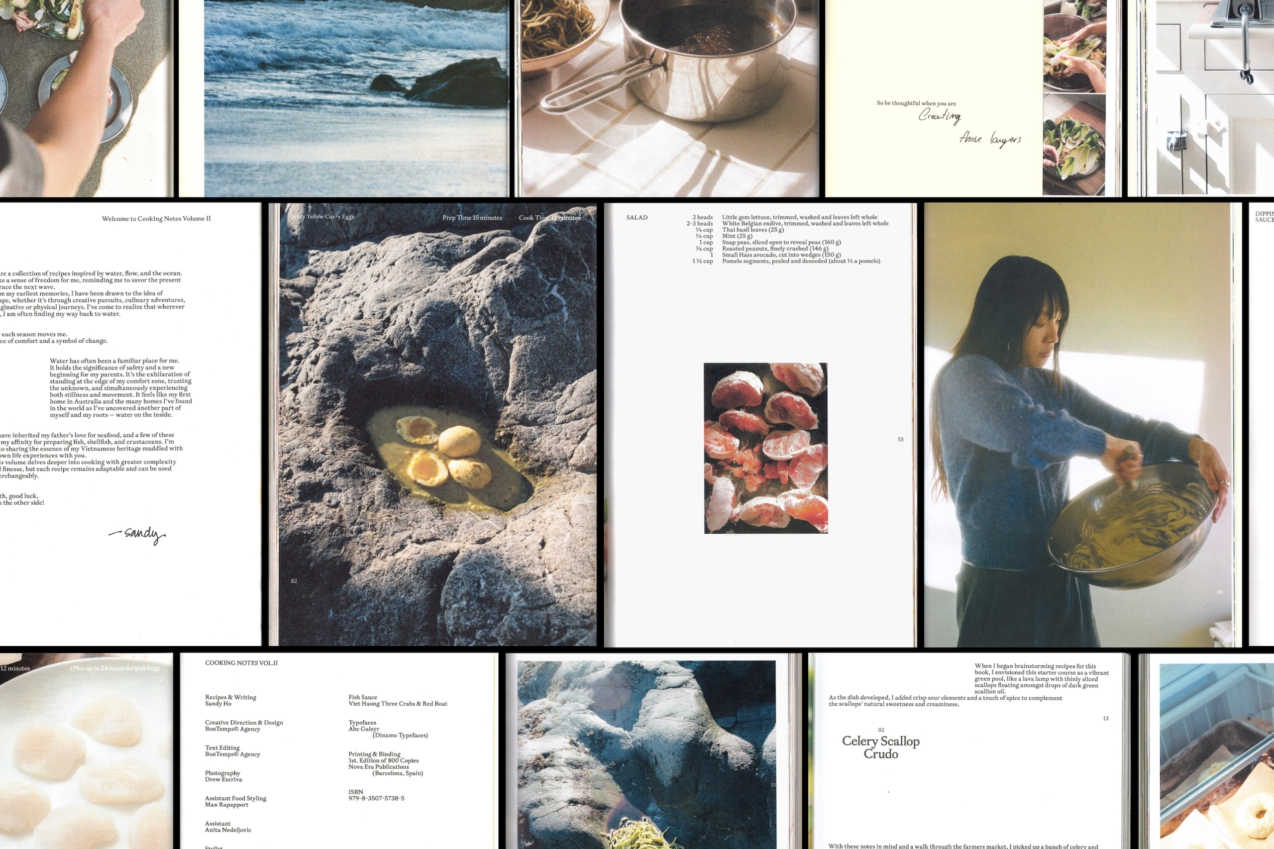
Cooking Notes Vol. II returns to the deeply personal world of chef Sandy Ho, this time through her lifelong connection to water. From the beaches of Sydney to years spent sailing and cooking around the world, that pull becomes the through line of a new collection of recipes and cooking notes
The recipes are more complex than those of Vol. I, calling for a more thoughtful and meditative approach to cooking. The design follows that shift. Where the first volume was exuberant and densely layered, Vol. II pulls back. The layouts are airier and more minimal, but the world inside them is more cinematic, emotional and alive.

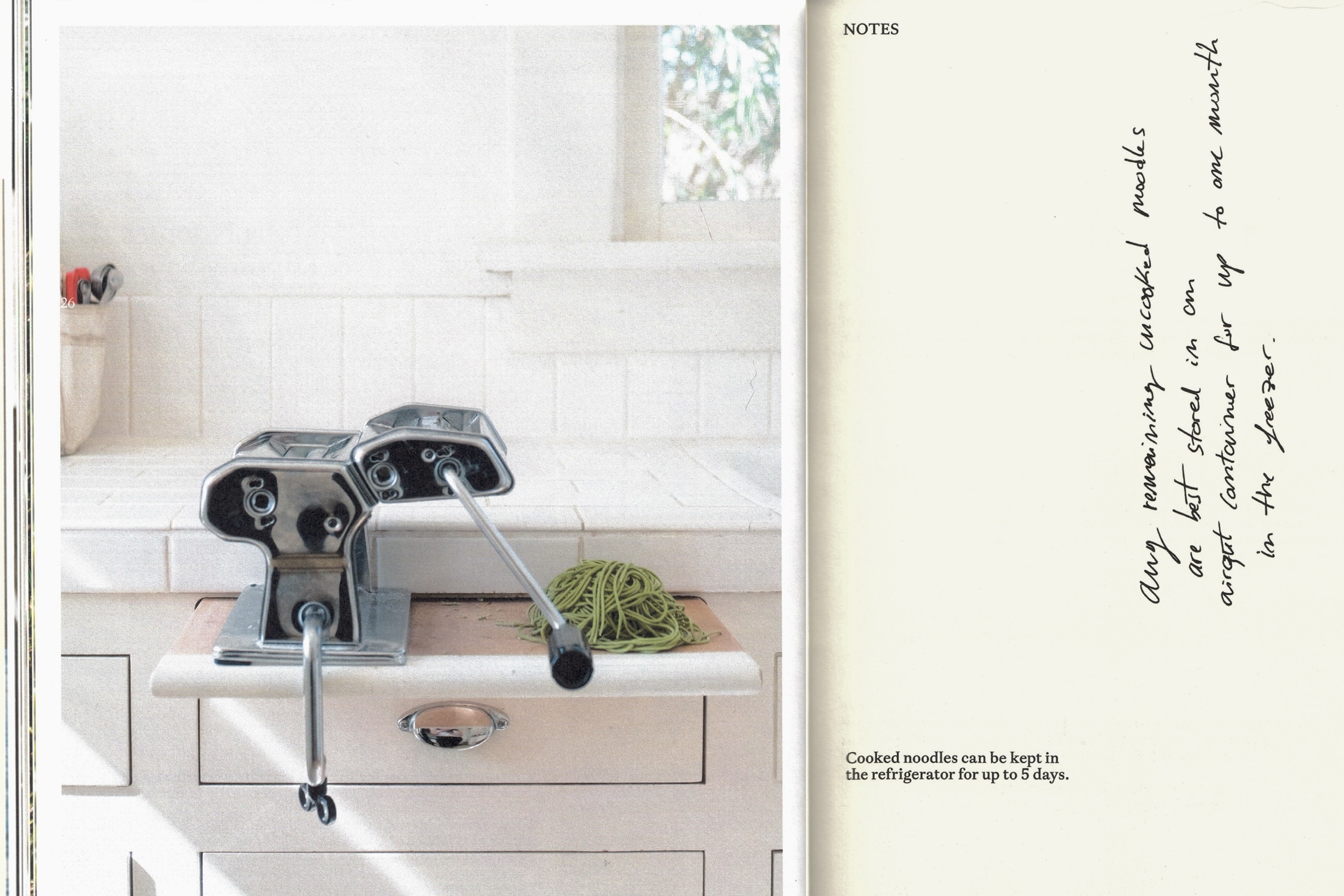
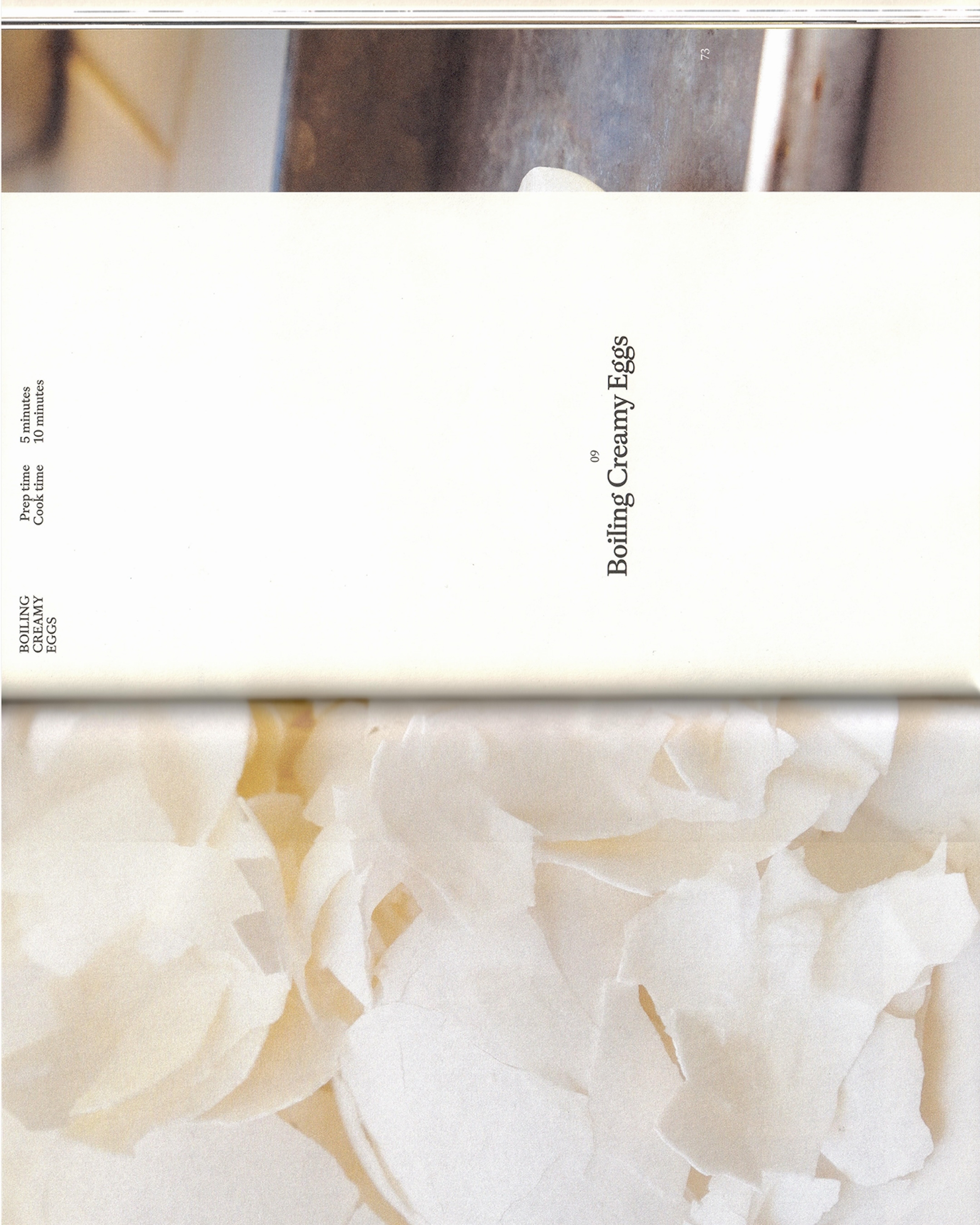
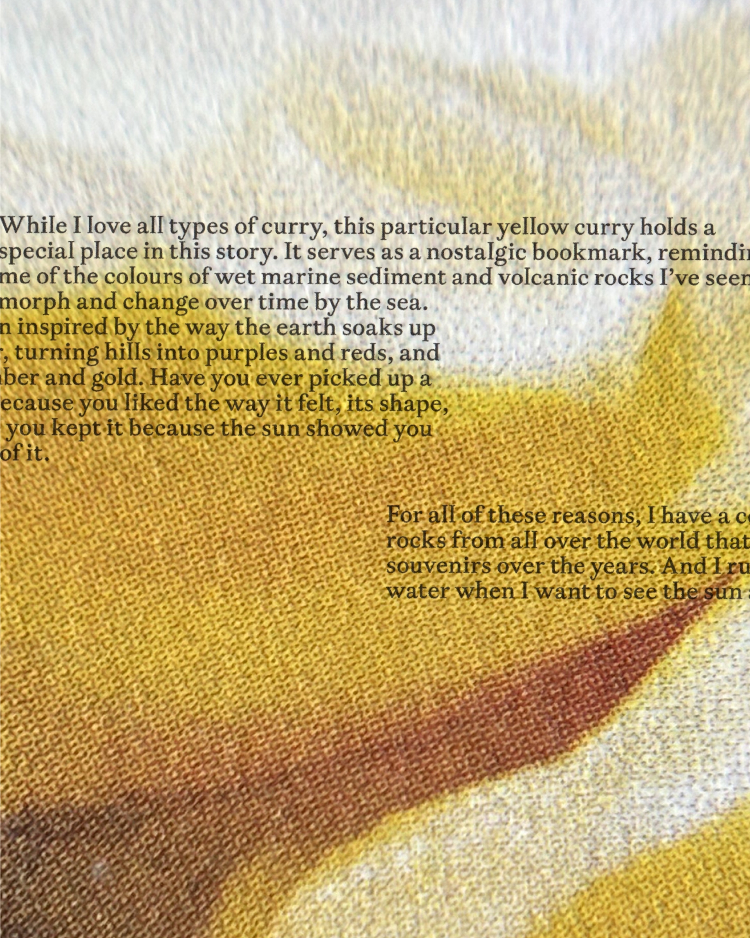
Transparent pages and handwritten notes return, interacting with text like memories surfacing mid-conversation.
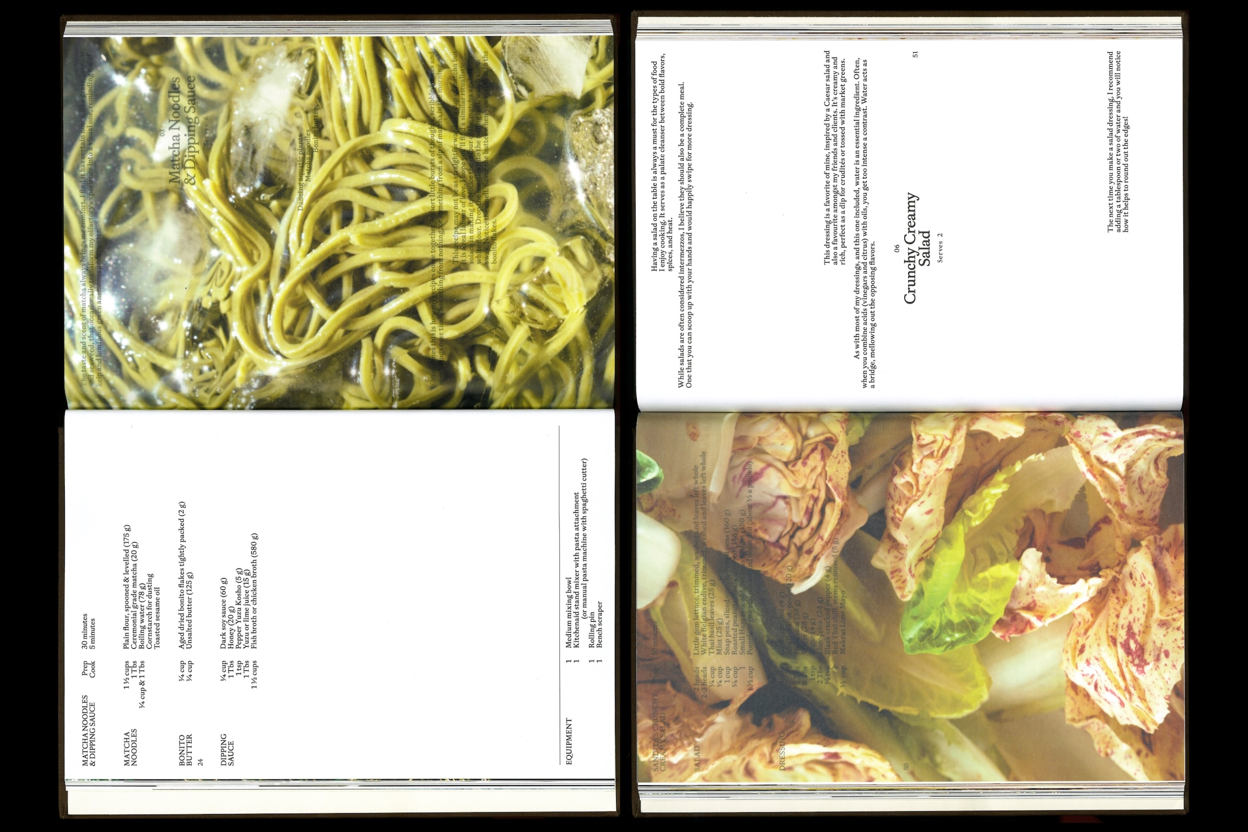
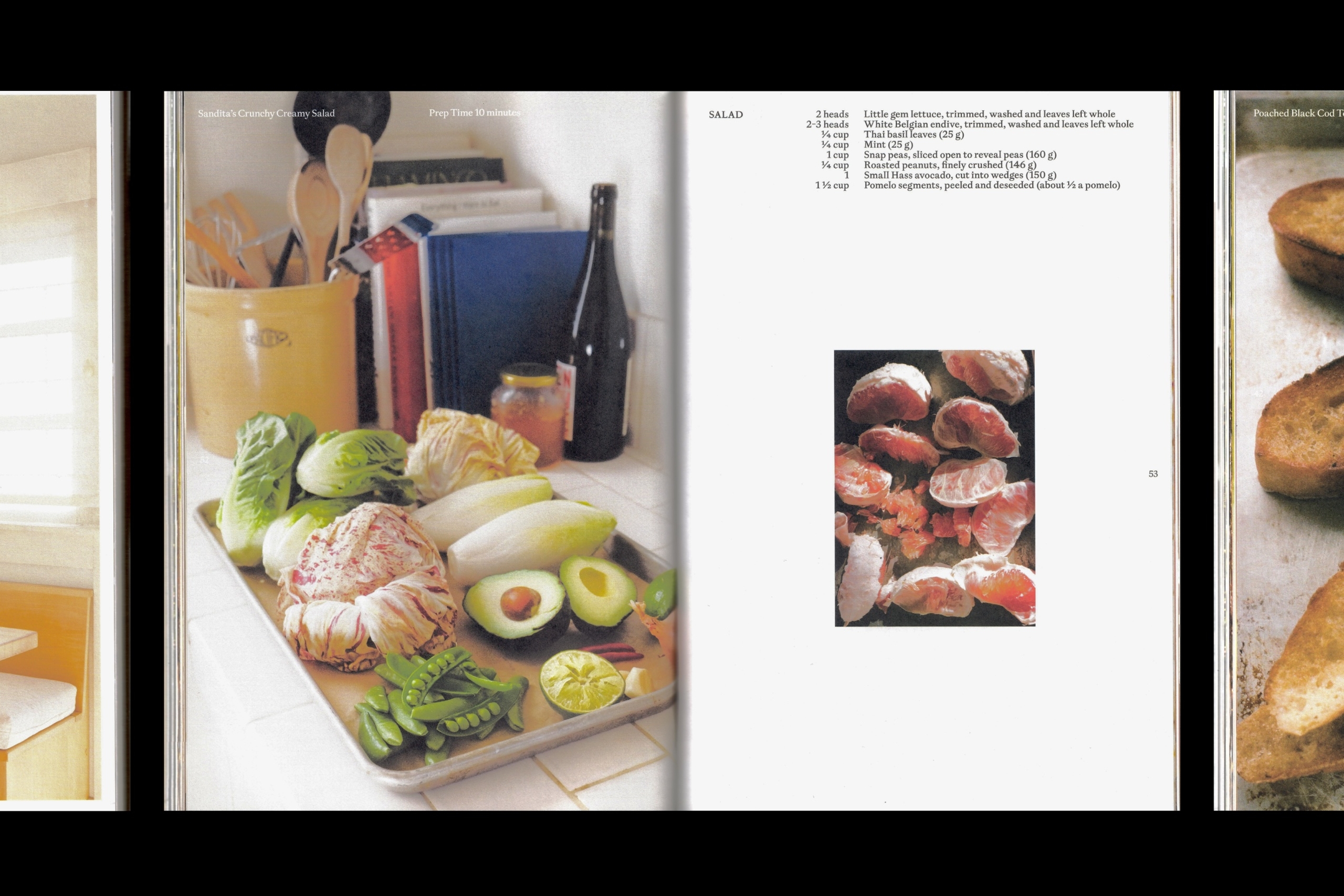
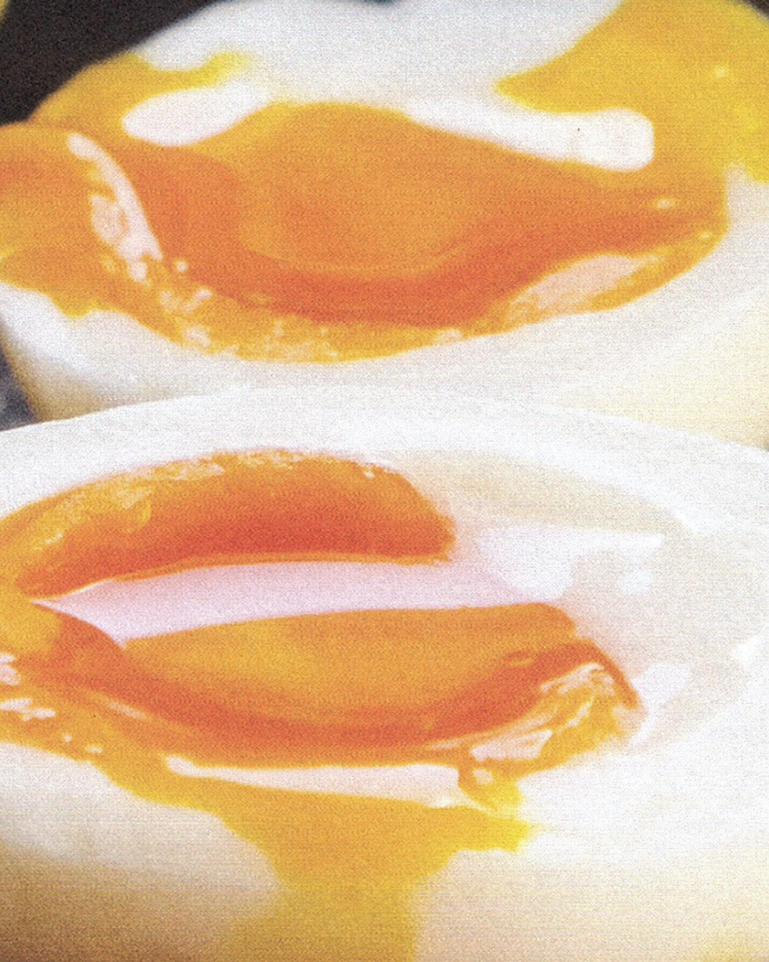
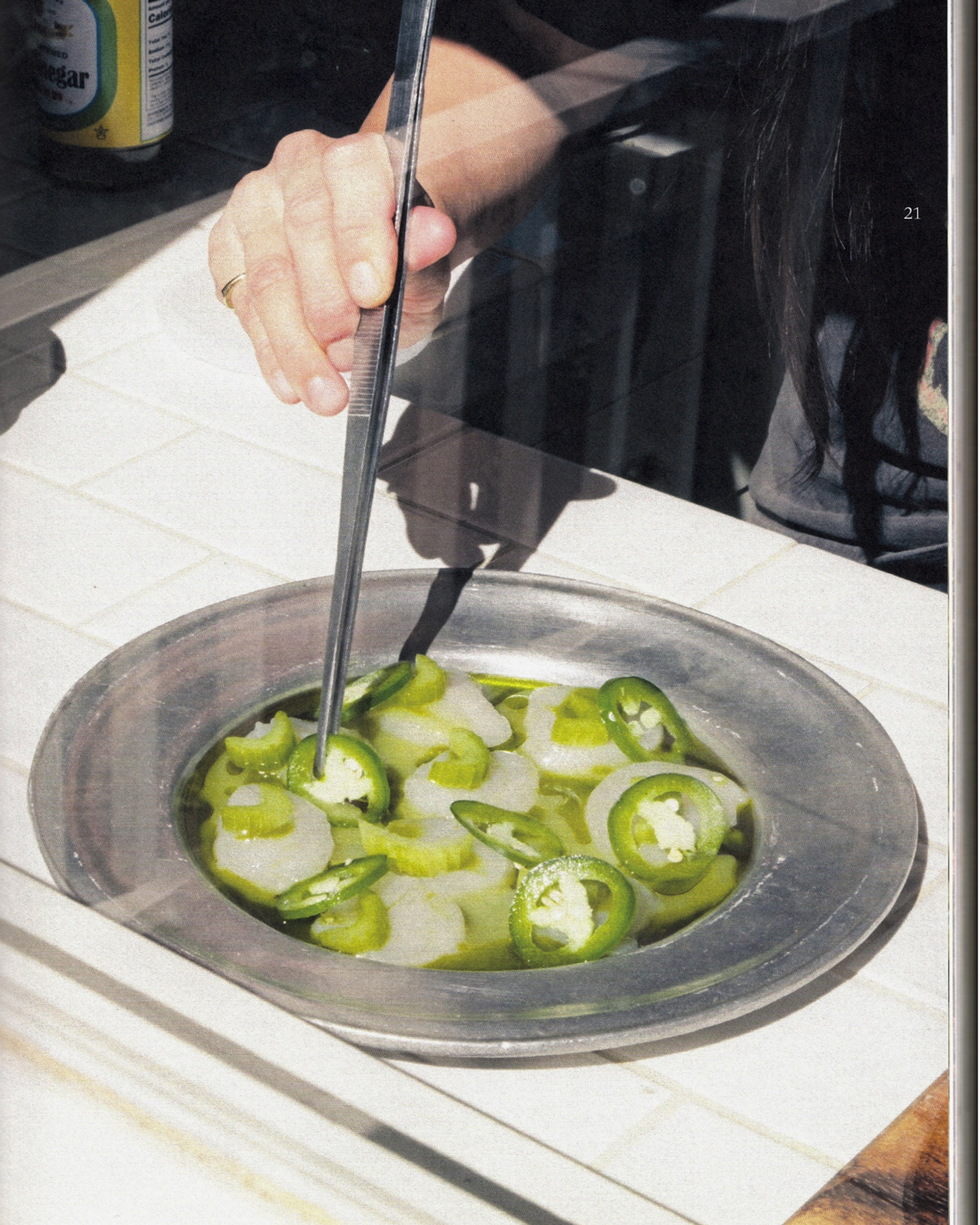
We directed the photography toward atmosphere and storytelling, rather than conventional recipe documentation.


“I’m incredibly proud of this one and the many many (many!) hours BonTemps and I put into fine-tuning even the tiniest minutiae! ”
Sandy Ho,
Author & Chef
The result is weightier in the hand, yet freer on the page.
A lasting addition to the series, and the kind of object print obsessives like us can’t resist.
Transparent pages and handwritten notes return, interacting with text like memories surfacing mid-conversation.
Photography Direction & Design
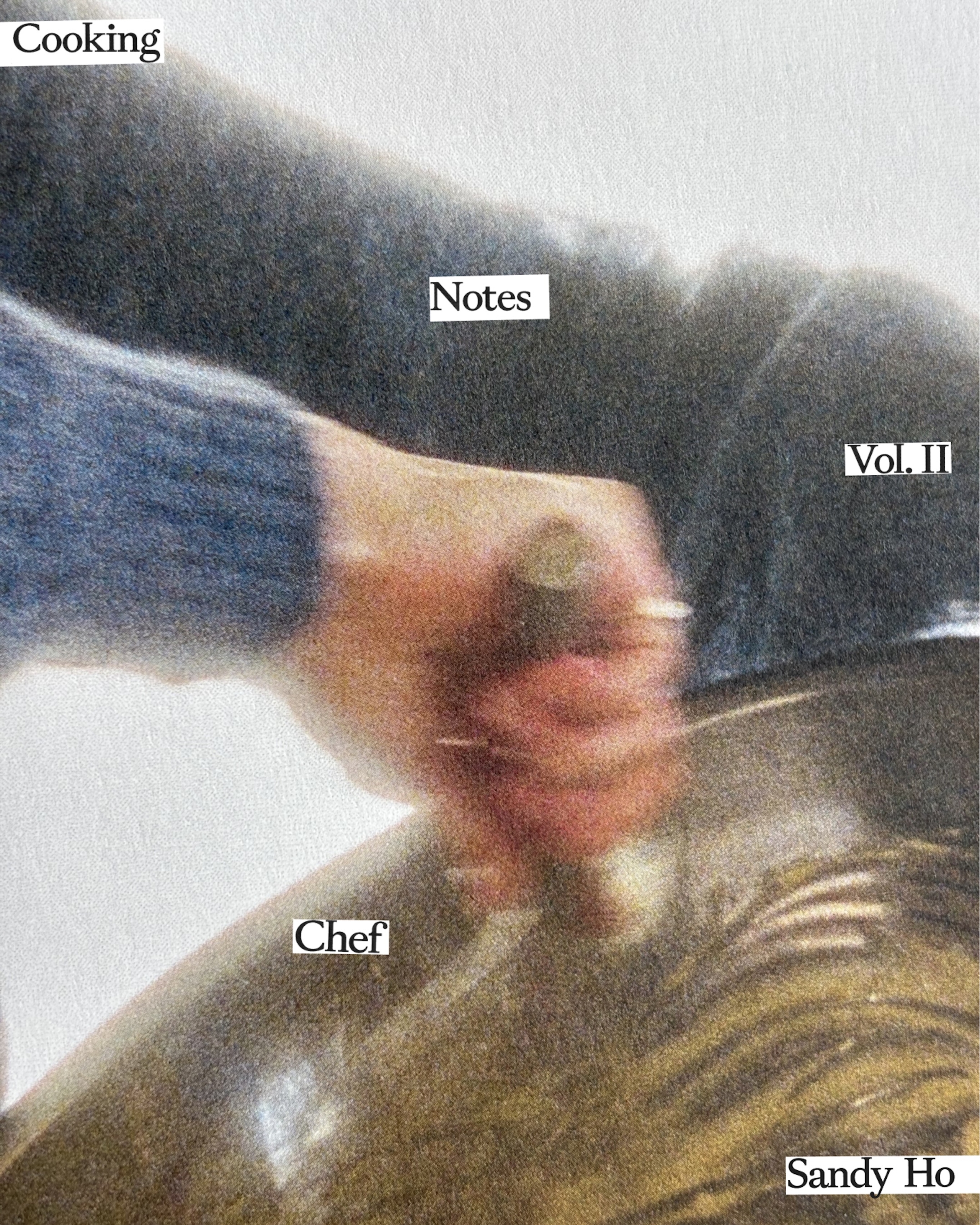
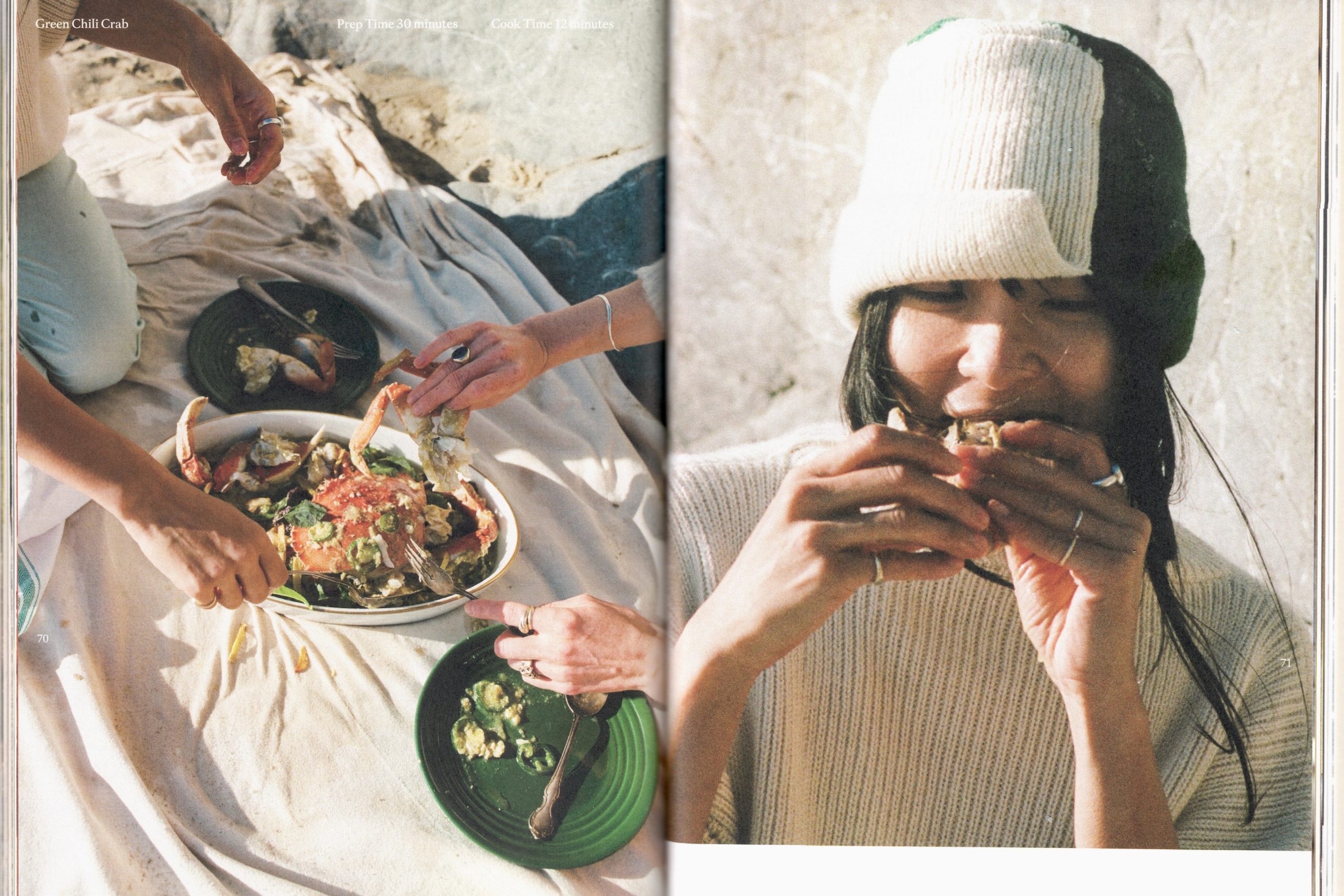
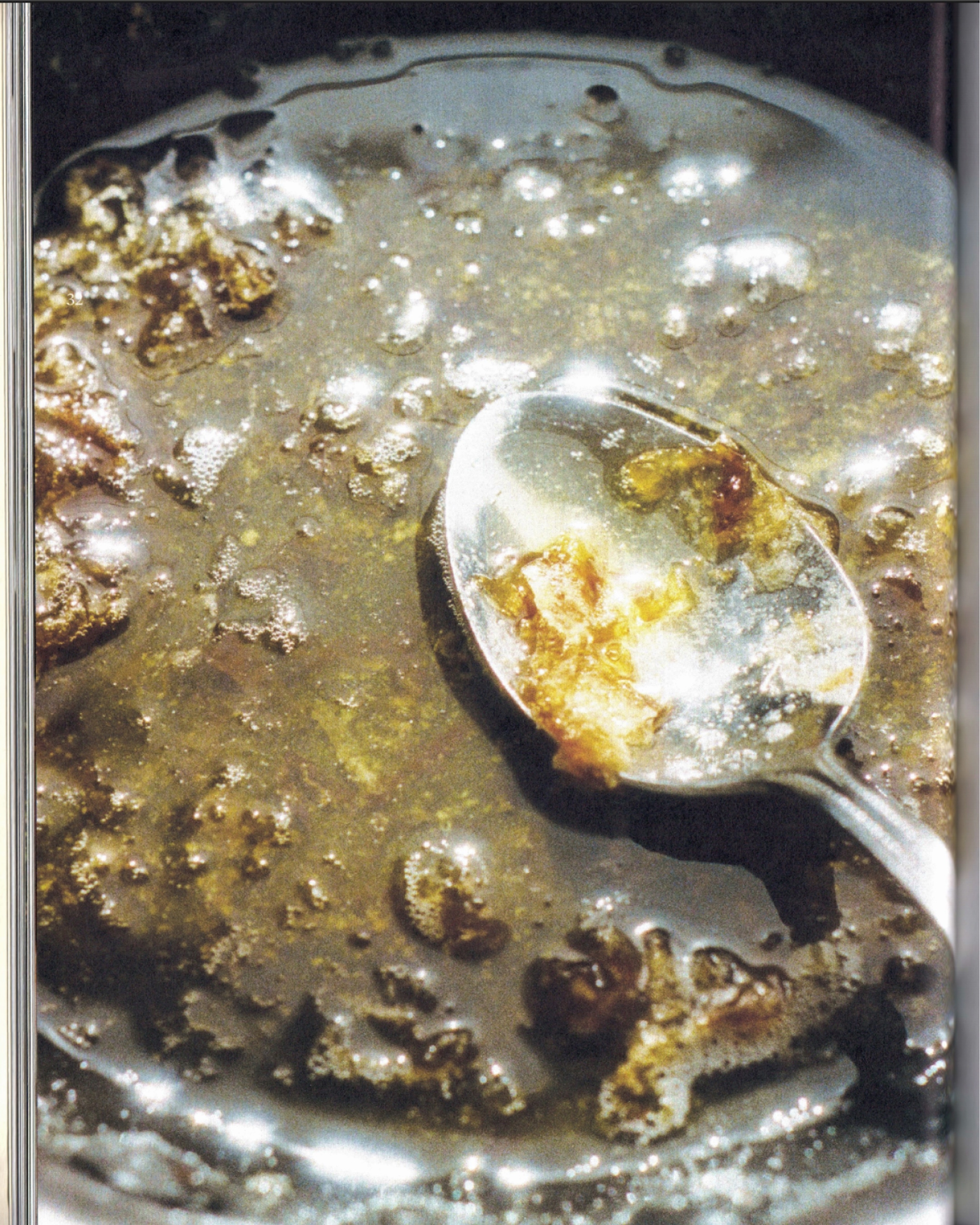
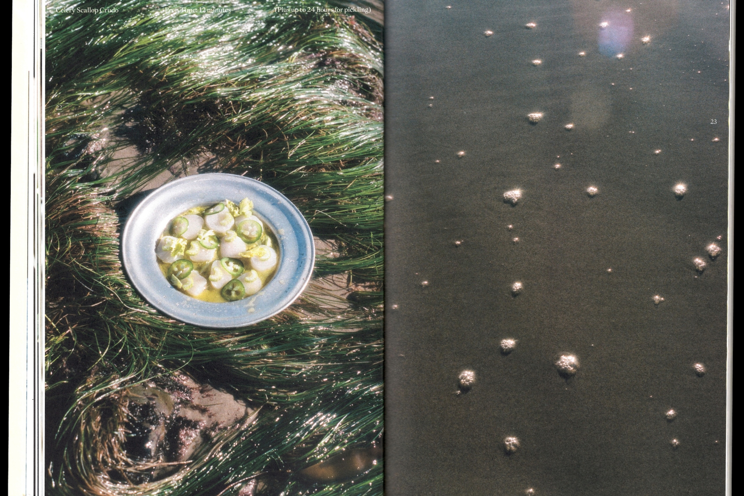
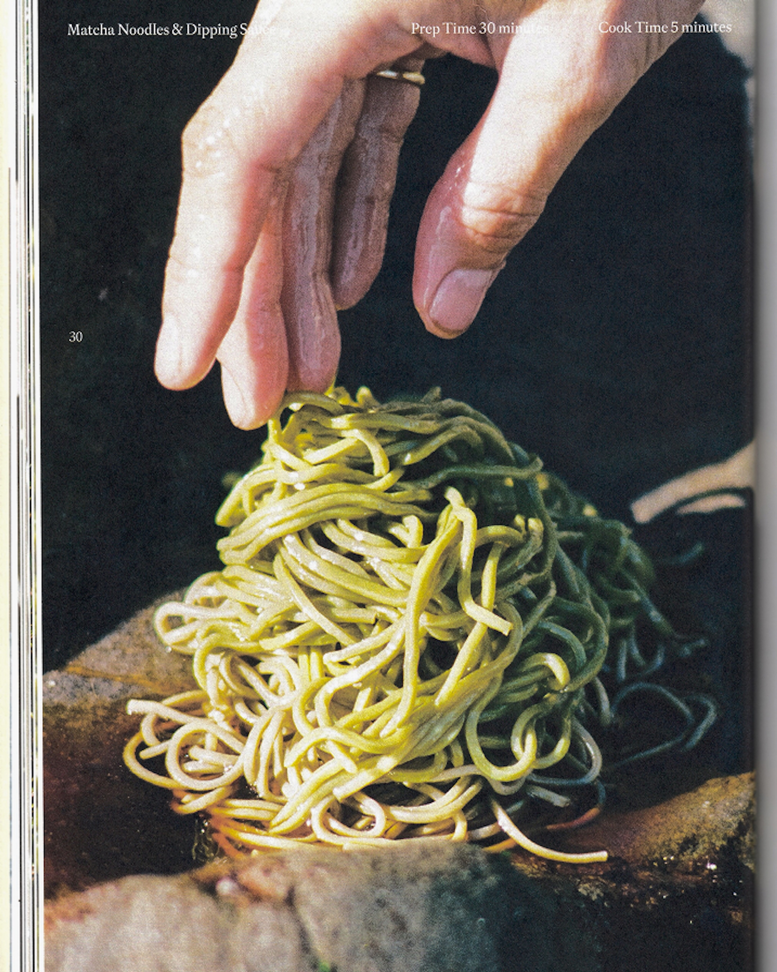
Shot on film by Drew Escriva, the images played a defining role in that evolution. We directed the photography toward atmosphere and storytelling rather than conventional recipe documentation, focusing on ingredients as subjects in their own right, process, and the small, accidental details of cooking.
At the same time, the layouts became freer. Rather than adhering to a strict grid, we let images and text move more intuitively from spread to spread.
The final image selection became central to the storytelling.
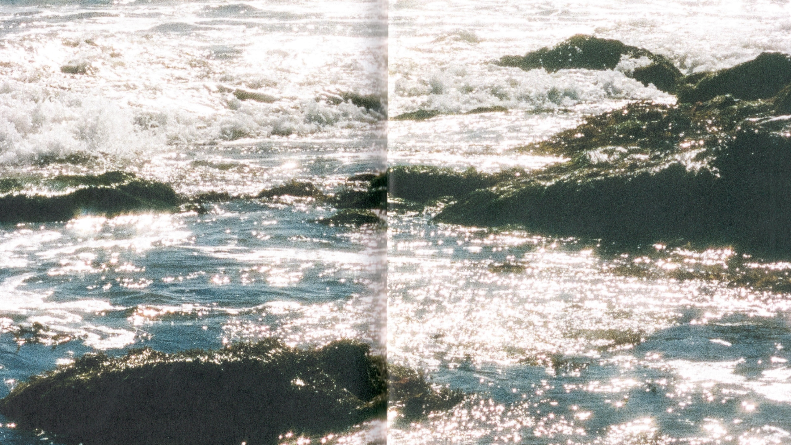
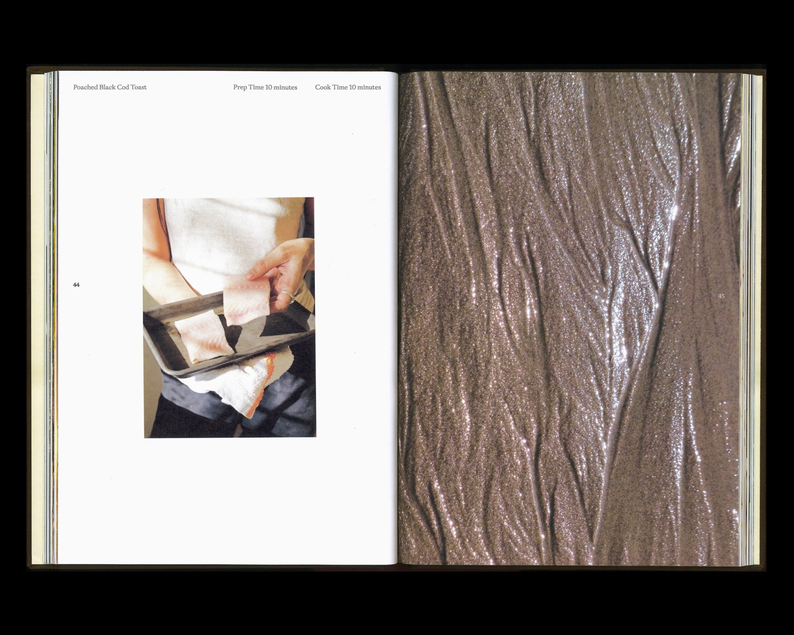
In the spread for Poached Black Cod Toast, a photograph of Sandy preparing the fish sits opposite an image of water moving across sand. The natural waves in the cod’s flesh echo the sparkling lines along the shoreline.
Placed together, ingredient and landscape merge into a single idea.
We directed the photography toward atmosphere and storytelling, rather than conventional recipe documentation.
“I’m incredibly proud of this one and the many many (many!) hours BonTemps and I put into fine-tuning even the tiniest minutiae! ”
Sandy Ho,
Author & Chef
Materiality
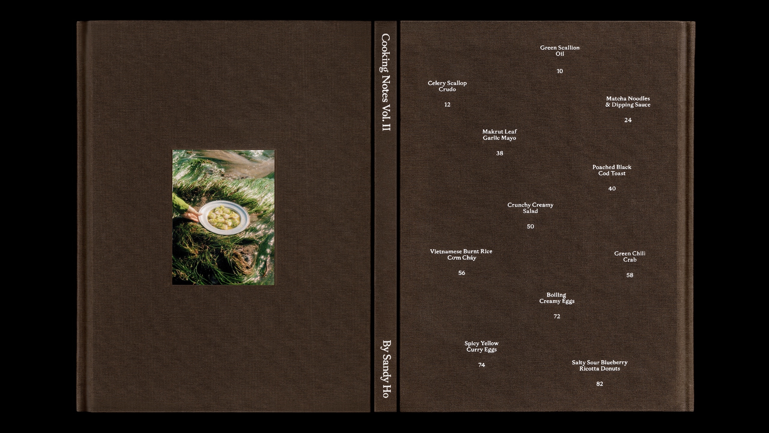
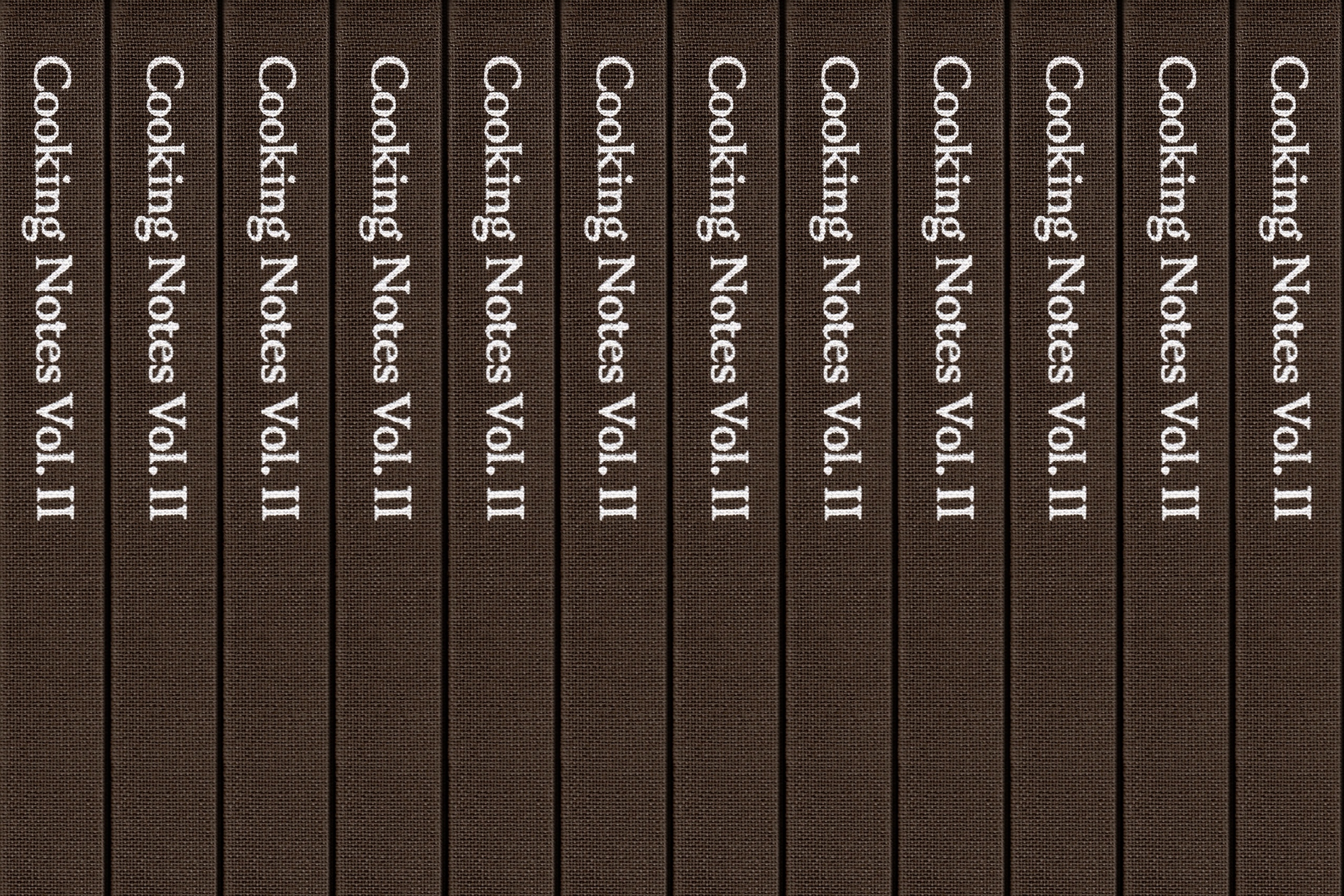
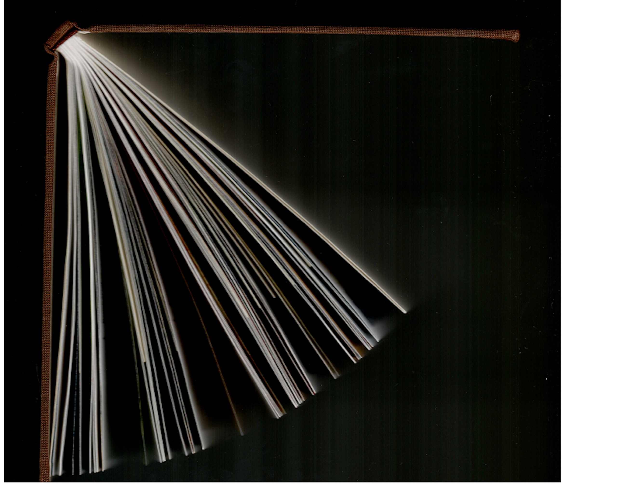
The most immediate material change is the hardcover, something we had wanted for Cooking Notes from the beginning and were finally able to realize. It gives this self-published, small-run edition greater weight and permanence.
The result is weightier in the hand, yet freer on the page.
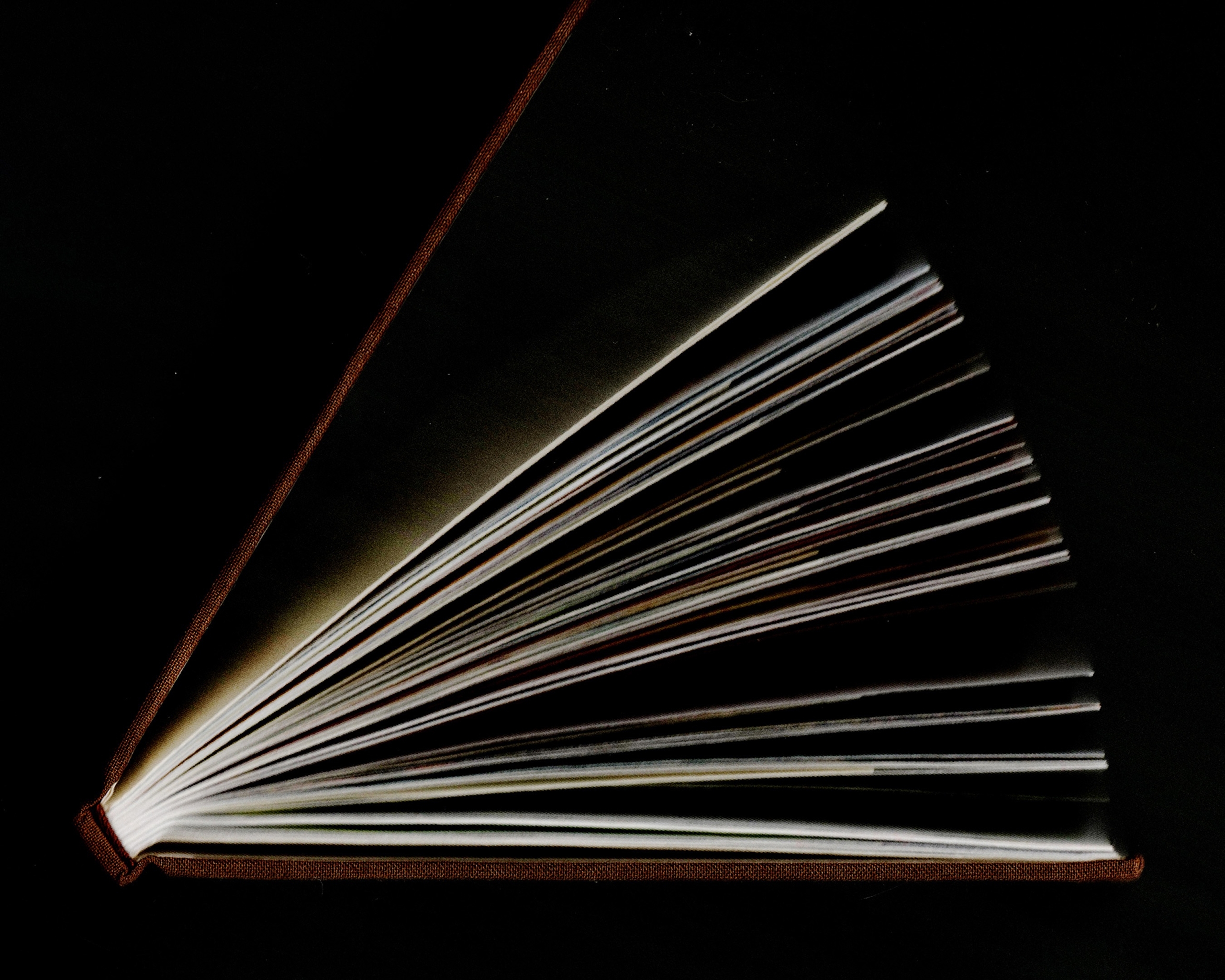
A lasting addition to the series, and the kind of object print obsessives like us can’t resist.
Project Recap
Cooking Notes Vol. II returns to the deeply personal world of chef Sandy Ho, this time through her lifelong connection to water. From the beaches of Sydney to years spent sailing and cooking around the world, that pull becomes the through line of a new collection of recipes and cooking notes
The recipes are more complex than those of Vol. I, calling for a more thoughtful and meditative approach to cooking. The design follows that shift. Where the first volume was exuberant and densely layered, Vol. II pulls back. The layouts are airier and more minimal, but the world inside them is more cinematic, emotional and alive.
Shot on film by Drew Escriva, the images played a defining role in that evolution. We directed the photography toward atmosphere and storytelling rather than conventional recipe documentation, focusing on ingredients as subjects in their own right, process, and the small, accidental details of cooking.
At the same time, the layouts became freer. Rather than adhering to a strict grid, we let images and text move more intuitively from spread to spread.
The final image selection became central to the storytelling. In the spread for Poached Black Cod Toast, a photograph of Sandy preparing the fish sits opposite an image of water moving across sand. The natural waves in the cod’s flesh echo the sparkling lines along the shoreline. Placed together, ingredient and landscape merge into a single idea.
This is perhaps the clearest example of the book’s visual logic and the looser, more associative way we intended the images to be read.
The most immediate material change is the hardcover, something we had wanted for Cooking Notes from the beginning and were finally able to realize. It gives this self-published, small-run edition greater weight and permanence.
The result is weightier in the hand, yet freer on the page: an intricate, lasting addition to the series, and exactly the kind of object print obsessives like us can’t resist.
Services
Book Design
Creative Direction
Photography
Custom Typeface
Gaisyr
by Dinamo Typefaces
BonTemps Team
Creative Direction:
BonTemps©Agency
Design:
Albert Mestres
Text Editing:
John Vallance
Collaborators
Printed by:
Pedro Nova Era, Barcelona
Author & Chef:
Sandy Ho
Photography:
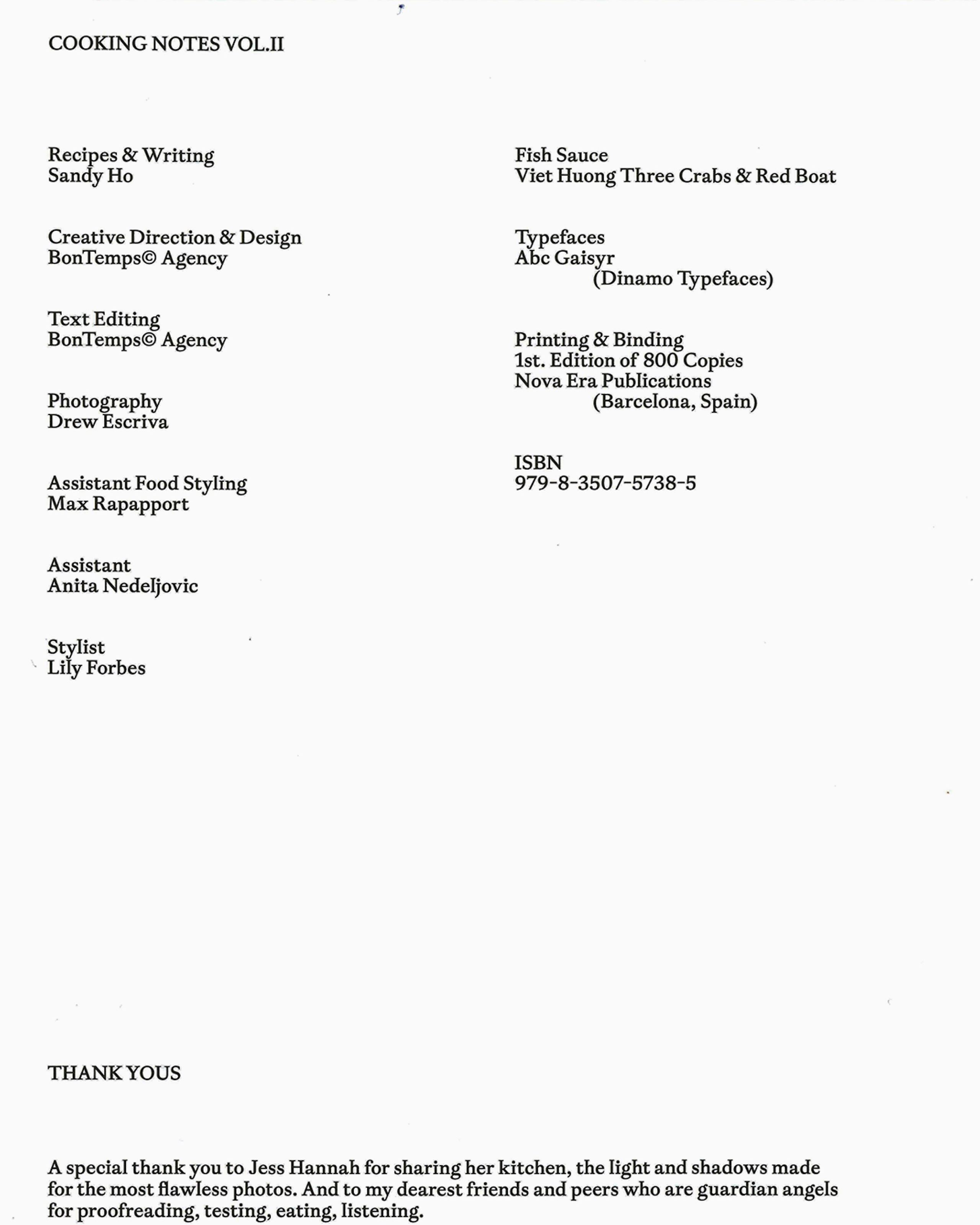
Drew Escriva